Controls
Controls are what your shopper touches. Each one asks a question about the product, and the answer drives the 3D model, the price, or both. On the catamaran, Length, Helm and Planks are controls. GUI Elements at a Glance shows every control type as the panel draws it, and The panel dresses the boat's in cards, swatches and pills.
You add them with Add control in the Controls tab of the GUI section. Give each one a label, since that is what your shopper reads, and a set of choices where it has them.
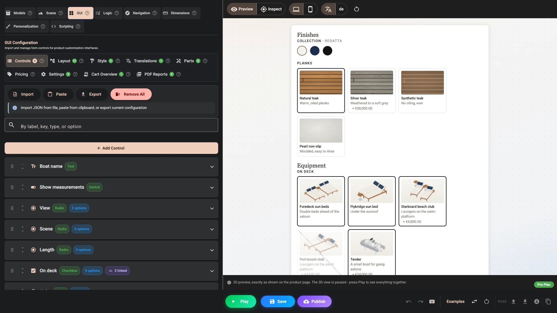
Every control has a key
Alongside the label, every control carries a Key 1 - a short identifier shown under a pencil. Composer creates one for you, so you can ignore it for a while, but it is worth knowing what it is.
The key is the name everything else in the project uses to refer to this control: a visibility condition, a logic rule, a pricing formula, a part's quantity expression, a focal's trigger, and the Layout element that places the control on the page. The label is only ever wording - changing it breaks nothing.
A key may be at most 24 characters, made of letters, digits and underscores, and must start with a letter or an underscore. It has to be unique in the project. The limit is tight on purpose: the key travels with the configuration, both into the order data and into the shareable link, so a short one keeps both small.
Renaming is safe. Composer rewrites every reference for you - conditions, formulas, expressions, triggers, element links and your translations - across the whole project, not just the GUI section. It refuses a name that is too long, malformed, or already taken, and tells you why rather than half-applying it.
Anything that has already left the project. A configuration link a shopper saved before the rename no longer carries that control's choice, and orders already placed keep the old name. Scripts are a separate case again - they receive your controls by label, not by key.
A description for the paperwork
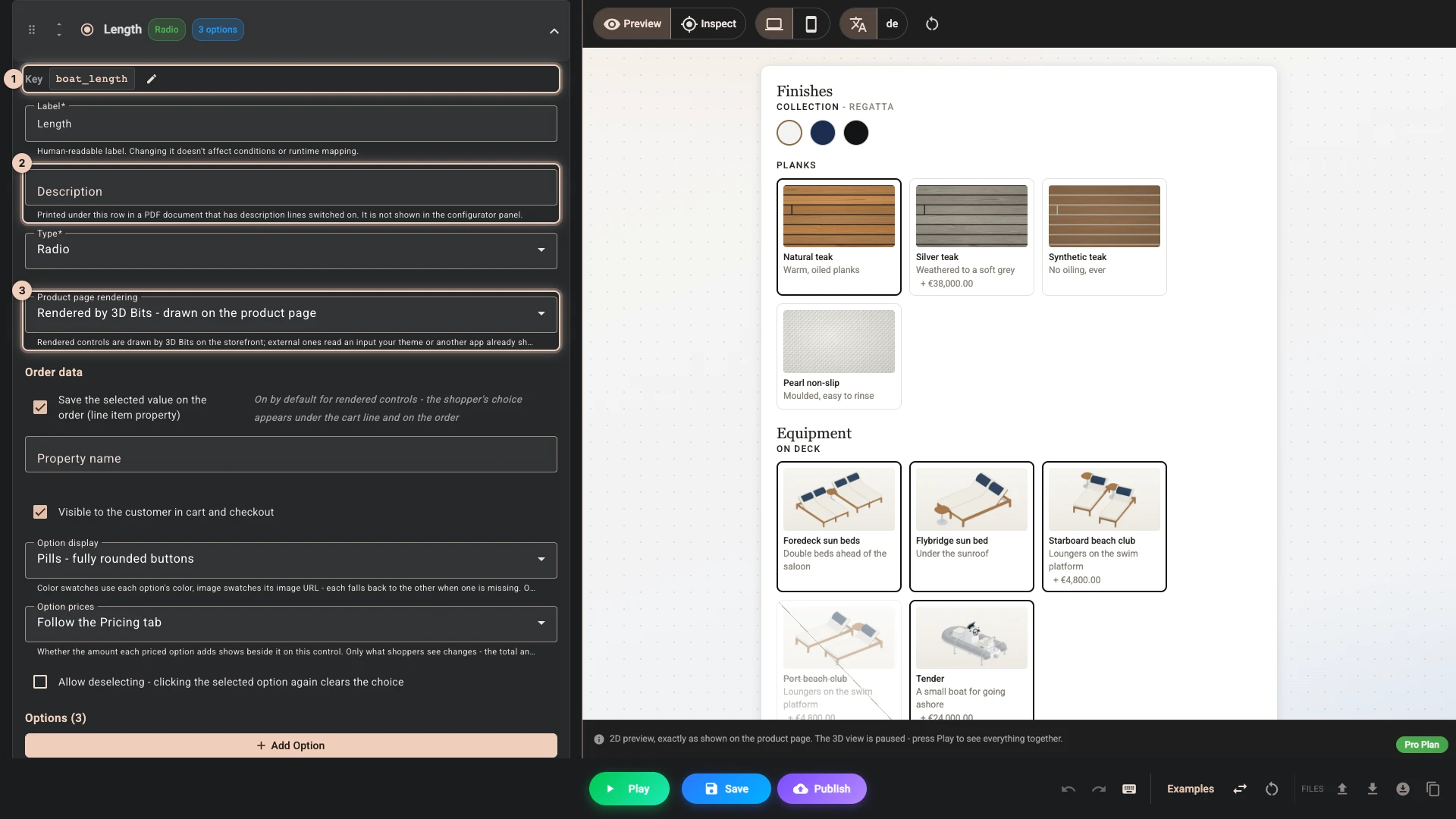
Under the label sits an optional Description 2, a sentence explaining what the control is asking for. It is not shown in the configurator and it exists for the PDF documents, which can print it as a small line under that control's row when you switch description lines on.
It is worth filling in where a label alone is ambiguous to whoever reads the sheet rather than the screen: "Length" means one thing to the shopper choosing it and another to the yard. Like the label, it is translatable.
Drawn by 3D Bits, or bound to your theme
Product page rendering 3 decides who draws the control on the live product page.
Rendered by 3D Bits - drawn on the product page is what a control you add here starts as. The app draws it, in Composer's preview and on the storefront, styled by your Style tab. This is the normal choice and everything else on this page assumes it.
External - bound to an existing theme input via selector means the control already exists on the page - it belongs to your theme, or to a product options app you already use - and 3D Bits only reads it. Choosing this reveals a Selector field, where you put a CSS selector that finds the element at runtime. See Custom forms for what the app can read and how it listens for changes.
The distinction matters most for conditions. On a rendered control, a visibility or availability condition is live everywhere - the preview and the product page both obey it. On an external control, your theme owns the field, so 3D Bits neither hides nor greys it out on the product page; only Composer's preview shows the condition. The condition still decides the price on the product page and at checkout, so mirror it in your theme: hide or disable the field whenever the condition does not hold, or make it a rendered control.
Choosing from a fixed set
Dropdown is compact and right when there are many choices or when the choice is not the interesting part of the page. A long list of hull colours belongs in a dropdown.
Radio shows every choice at once, which suits two to five options where you want the shopper to see the range: Classic, Ergonomic or Sport for the helm. Tick Allow deselecting - clicking the selected option again clears the choice when having no answer is a real answer.
Checkbox is for independent extras, where any combination is allowed: On deck offers sun beds, beach clubs and a tender. Untick Allow multiple selections and it behaves like a radio instead; leave it on and Minimum selected and Maximum selected set how few and how many a shopper may tick.
Switch is a single yes or no, presented as a toggle, such as Show measurements. Price when enabled gives it a price of its own for when it is on.
Each of these has an answer before the shopper touches it. A dropdown or a radio starts on the option you tick as Default, or on its first option when none is ticked, so that option's price is in the total from the start. A checkbox starts with only its Default options ticked, and with Allow multiple selections off the shopper can untick the one they chose, leaving it empty. A switch is off unless you tick On by default.
Numbers and free entry
Range is for a continuous measurement. It pairs naturally with a pricing formula, so the price moves as the shopper drags. Set sensible minimum, maximum and step values, because a slider that allows a 3 litre fuel tank is a slider you will regret. A Unit follows the number wherever the slider shows it: in the tooltip by default, and in the readout and the scale labels when the theme shows those. It is a label only, and the value stays a plain number.
Number is the same idea when the shopper knows the figure they want and would rather type it than aim at a slider. Both start at their Default value, or at Min when that is empty.
For both, the fixed Min, Max and Step can be replaced by an expression over your other controls, in Min expression, Max expression and Step expression. When a recomputed bound excludes the current value, the value is pulled back inside it.
A number typed above the maximum or below the minimum shows an error, and Add to cart waits until it is fixed. If another choice then hides the control, the value is pulled back inside its range, since the shopper can no longer see the error. A typed number counts as the number itself, so 3.0 and 03 both match a condition such as equals 3.
Text collects a line of words, most often a name, such as the Boat name printed on the hull.
Textarea is the same for longer text, such as notes for the yard. Rows sets how many lines it shows, three unless you change it. Placeholder, on text, number, email and textarea fields, is the hint shown while the field is empty.
Date and Time collect a date or a time, for products where a delivery day or an event time is part of the order.
Email collects an address, validated as one.
File lets a shopper upload their own artwork. Combined with personalisation on the Pro plan, an uploaded image can appear directly on the product. Accept limits which file types the shopper's file picker offers, such as image/*,.pdf; it is not a security check, so treat every uploaded file as untrusted. Allow multiple file selection lets the shopper pick more than one file at once; the preview, and any personalisation, use the first.
Color gives them a colour picker for products where you genuinely offer any colour rather than a chosen range. It starts at Default color, or at black when that is empty.
When a change reaches the model
Emit behavior, on Range, Text, Number, Email and Textarea controls, decides when the 3D view hears of a change. The panel's own conditions and the price follow every change at once, so this only touches what the change does to the scene: a model to swap, a decal to redraw, a focal to fly, a script to run.
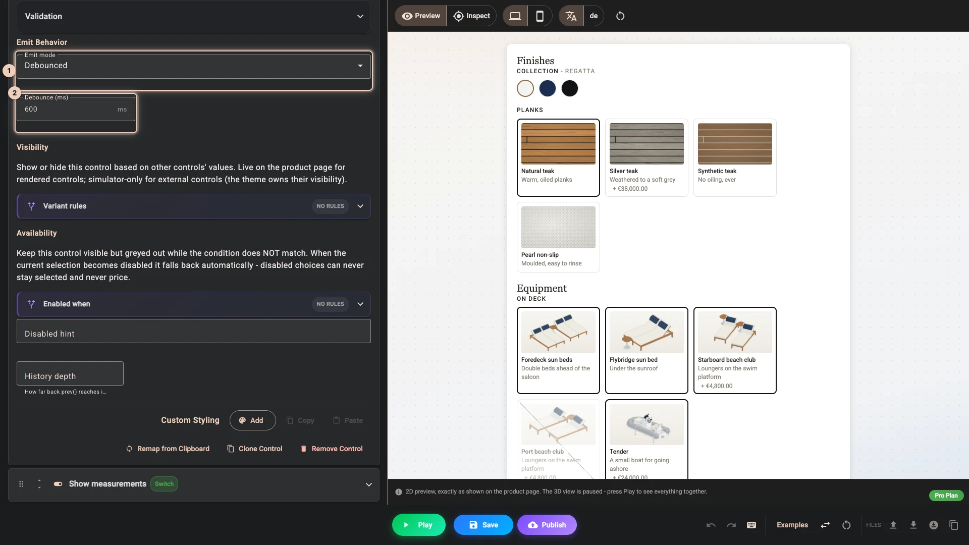
| Emit mode 1 | On a Range | On the fields a shopper types in |
|---|---|---|
| Default | When the shopper lets go of the slider | 300 milliseconds after the last key press |
| On change | At every step of the drag | At every key press |
| On drag end | When the shopper lets go of the slider | Not offered |
| Debounced | Not offered | Debounce (ms) 2 after the last key press, or 300 with the box empty |
Leave it on Default unless you see a reason. Boat name prints on the hull, so a longer debounce keeps the decal from being redrawn for each letter, as the picture shows.
Buttons
Button is not a question. It performs an action. Icon puts one of the built-in icons on it; for one of your own, leave Icon on None and fill in Button image URL (optional) or Or inline SVG (optional). Its Action starts on Trigger change event (default), which emits a pulse each click that a focal or a script can react to, or you can pick Reset all options to defaults, Download the customer PDF report or Download the 3D model (GLB). A button carries no value, no price and no order data, and it is never validated. In a scene with a focal, a reset also flies the camera back to its starting view, with the motion set under Camera motion.
The two downloads need the Pro plan. On any lesser plan both carry a premium badge in the list and choosing one opens the upgrade dialog instead of setting it, and publishing refuses a model download or a PDF document that is switched on. The PDF download also needs the customer document switched on under PDF reports - a button with nothing to generate stays inert.
Download the 3D model (GLB) hands the shopper a single .glb of what they are looking at - every model currently visible, in the position it is on screen, with the materials they chose baked in. It is a snapshot, not a configurator: the file carries the one chosen material per part, so a shopper cannot reopen it elsewhere and switch variants. Personalisation the shopper applied is included - a name projected onto the hull comes through, because it is part of what they bought. What is left out is the scenery: the background and skybox, points of interest, dimension annotations, and the cameras and lights. A ground plane you modelled and uploaded is a model like any other, so it is included; hide it with a variant if you would rather it were not. Download file name (optional) names the file, which is model.glb otherwise.
Compress with Draco (smaller download) is worth ticking when your models are heavy - it usually shrinks the download several times over. The trade is compatibility: Blender, three.js and the common glTF viewers read Draco files, but macOS Quick Look does not, and it is the one your shoppers are most likely to hit when they double-click the file. The first export on a page also downloads the ~430KB Draco encoder into the shopper's browser, because the compressing happens there; if it cannot be fetched the file is exported uncompressed rather than failing.
Making the choices look like the product
For dropdowns, radios and checkboxes, Option display changes how the options are presented, and this is where a configurator starts to look considered rather than generic. The panel picks one for each of the boat's choices.
Text (default) is the plain list. Color swatches show the actual colour, which is the sensible way to pick a hull. An option can carry more than one colour, drawn as a segmented swatch, which is useful for a two-tone finish.
Image swatches show a picture per option, which is what you want for teak, marble or textile, where a colour name tells the shopper nothing. Swatch and image modes fall back to one another per option, so an option with no picture shows its colour instead of a gap.
Cards - roomy tiles with an image give each option a tile with its image, for choices that need explaining. A Card shape sets the proportions of those images for this control alone, so a portrait fabric picker and a wide picker can live in the same panel. Buttons - rounded rectangles and Pills - fully rounded buttons are compact labelled shapes, good for sizes.
A dropdown has its own list: Native dropdown - themed box, device-native list, Styled list - custom popup matching your theme, Styled list with option images and Styled list with images and roomier rows.
Whichever you pick, an option's description is shown. There is nothing to switch on: where the option is a row of text it appears as a second line under the label, where it is a swatch or a chip it appears in the tooltip, and in a plain dropdown it is added to the option's text. Keep descriptions to a phrase - a swatch tooltip is not the place for a paragraph.
Naming and pricing options
Each option has a Value 1, which is what the configurator matches against, and a Label, which is what the shopper reads. Keep values simple and stable, and put the nice wording in the label.
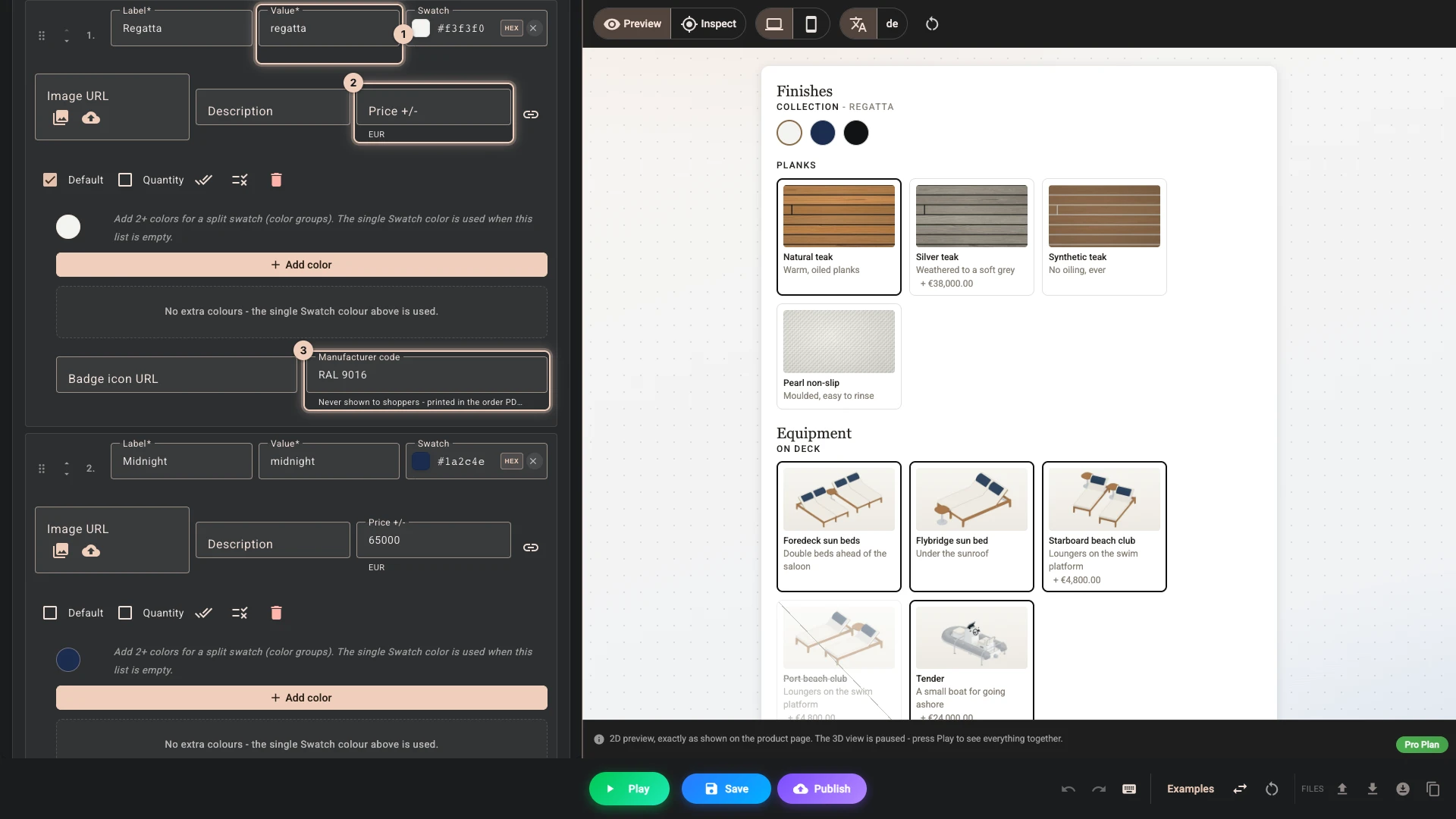
Price +/- 2 is the amount, in your store's currency, that choice adds to the price of one configured item, covered in Pricing: Midnight adds 65000 in Price it. Option prices, on the control, shows or hides those amounts beside its options whatever the Pricing tab says. Only what shoppers see changes, never what they pay.
On the Pro plan an option can also point at real products in your catalogue, with the link button at the end of its row, so choosing it adds your actual stocked items to the order. One option can carry up to ten of them, each with its own quantity. Linking more than one product to a single option decides how the order is charged, so read Linked products before you do it.
Ticking Quantity on an option lets the shopper choose how many of it to add, with a +/- stepper that appears once they select it. The price beside the option is then charged for each one. You set Max (required, and enforced at checkout), Min, Step and Start at, and a button copies those settings to every option in the control. A shopper-chosen quantity also affects how the order is charged, so it is worth reading the same page.
An option shown as a swatch or an image swatch also has a Manufacturer code 3, which is never shown to your shopper but prints on the order document, so the person making the thing sees "RAL 5004" rather than "Midnight".
It is never displayed to a shopper, but it is published. The configuration your product page downloads carries it, so anyone who views the page source can read it. Use a reference you are happy to publish - a RAL or Pantone code is exactly right. Do not put supplier names, cost codes or internal part numbers here.
Showing an option only when it applies
An option can be set to appear only under certain conditions, and the same applies to whole controls. The conditions button on an option's row opens its Visible when and Enabled when, and each control carries its own under Visibility and Availability.
For simple dependencies, set the condition on the control or the option directly. For anything involving several things at once, Logic is the better tool: the boat's tender and its Port beach club share a rule there, in Options and rules. A rule that asks what a control held before may need History depth on that control, as Expressions explains.
Disabling cascades: switch off a section and everything inside it is greyed out too, however deeply nested. Anything a shopper cannot reach is also not charged for, since billing someone for a choice they could not make would be wrong.
Hiding versus greying out
Every control, and every option inside it, carries two independent conditions, and they answer different questions.
Visibility takes the choice off the page. Use it when the choice is irrelevant: the 15 m boat has no foredeck sun beds, so that option leaves the panel.
Availability - the Enabled when condition, with a Disabled hint beside it - leaves the choice on the page and greys it out. Use it when the absence itself is worth knowing: Port beach club stays in view, crossed out, with the hint "The tender stows here", because a shopper who cannot find an option assumes you do not offer it at all.
Both stop the choice being charged. A hidden option never prices, a greyed one never prices, and checkout applies the same conditions, so what the shopper saw and what they pay cannot drift apart. A hidden or disabled control is also skipped by validation, so a required field that a condition hides or greys out never blocks Add to cart. An area you hide on some screens with Hide on in the Layout tab is different: its required fields still block Add to cart on those screens, where the shopper cannot see them, so keep required controls out of such an area.
A disabled choice can never stay selected. If the shopper has already picked something and your condition then turns against it, When the selected option becomes disabled decides where the selection goes: Switch to default option (default) moves to the option you marked as the default, or to the first one still available, and Clear the selection empties the control - which only truly empties it on a control that allows deselecting, and otherwise falls back the same way.
What reaches the order
Under Order data, a rendered control decides what your fulfilment team sees.
Save the selected value on the order (line item property) writes the shopper's choice as a line item property, so it appears under the cart line and on the order. It is on for a control you add here, because the choices a shopper made are the point of the order; Show it off turns it off for Scene and View, which do not change the boat that gets built. Property name changes the wording shown there, defaulting to the control's label. A value shows in the cart and at checkout until you untick Visible to the customer in cart and checkout, which keeps it on the order but out of the shopper's sight - useful for something you need internally that would only confuse them.
A File control goes by its own switch instead: Attach the uploaded file to the order (customer file reaches you as a link) sends the file through Shopify's native cart upload, so you receive a link on the order. It is on by default.
Buttons carry no order data at all. External controls carry none either - they are your theme's own inputs, and they already reach the order the way your theme sends them.
Shop Pay, Apple Pay and the other accelerated buttons take a shopper from the product page straight to checkout, skipping the cart - which is where this data is attached. So as soon as anything in your configurator writes to the order, the app hides those buttons by default rather than letting a configured product be bought without its configuration. If you want them back, that is a decision to make deliberately, knowing what is lost.
Validation
Validation, on every control but a button, can require an answer with Required. Text fields can be limited with Min length and Max length and, on Text and Email, checked against Pattern (regex). If something is required and missing, the shopper is told rather than being allowed to buy the wrong thing. Boat name uses Max length for its 16 letters.
You can write your own message for Required, Min length, Max length and Pattern (regex), or leave the built-in one. A number outside Min and Max, too few or too many ticked boxes, and an email address that is not one show built-in English messages, such as "Enter a valid email address". You can reword any of these messages per language in Translations, yours and the built-in ones alike. A control's message appears under it once the shopper has used the field, and while anything is outstanding the panel's Add to cart stays disabled, with "Complete the required fields to continue" under it. On a switch, Required means it must be switched on.
The Validation summary element collects every outstanding problem in one spot instead of leaving them scattered.
While something in the tab itself needs fixing, such as a control with no label, the bottom bar shows Needs attention, which lists each problem and takes you to it.
Import, paste and export
The row above the list works on the controls alone, not on the layout, the rules or the rest of the scene.

- Import 1 reads a
.jsonfile, and Paste 2 reads the same from your clipboard. Either way it has to be a list of controls, which is what Export writes. - If the tab already holds controls, you choose. Replace all removes them and the conditions that point at them. Append keeps them and adds the new ones, with a number on any key already taken, such as
helm_style_2. - Export 3 downloads the controls as a
.jsonfile, as a backup or to import into another project. - Remove all 4 clears the list after asking. Every condition that names those controls goes with them, across the whole project, and an advanced expression that names one needs fixing by hand.
At the bottom of each control, Clone control copies it under a new key. Remap from clipboard takes a list holding one control from your clipboard and rewrites this control's label, type, options and selector from it, keeping the key, so what points at the control stays connected. It asks first and names any option values that would go.
Keeping it manageable
The temptation with a good configurator tool is to expose everything you are capable of making. Resist it a little. A shopper facing forty controls buys nothing, while the same product with six well-chosen questions sells.
If you genuinely have many options, group them with sections, accordions or tabs in the Layout tab, and consider hiding advanced ones behind a condition until they are relevant.
Verified against the product in November 2026