Driving 3D Bits from Your Own Form
Most stores build their option panel in Composer and never read this page. Composer gives you the controls, the styling, the logic and the pricing, and because those controls are ours, everything on this page is handled for you.
This page is for the other case: you have a development team, you have built or intend to build the product form yourself, and you want the 3D scene to follow it. That works well. What follows is the contract it works to, so you can build against it rather than guess at it.
3D Bits reads your page twice on every pass.
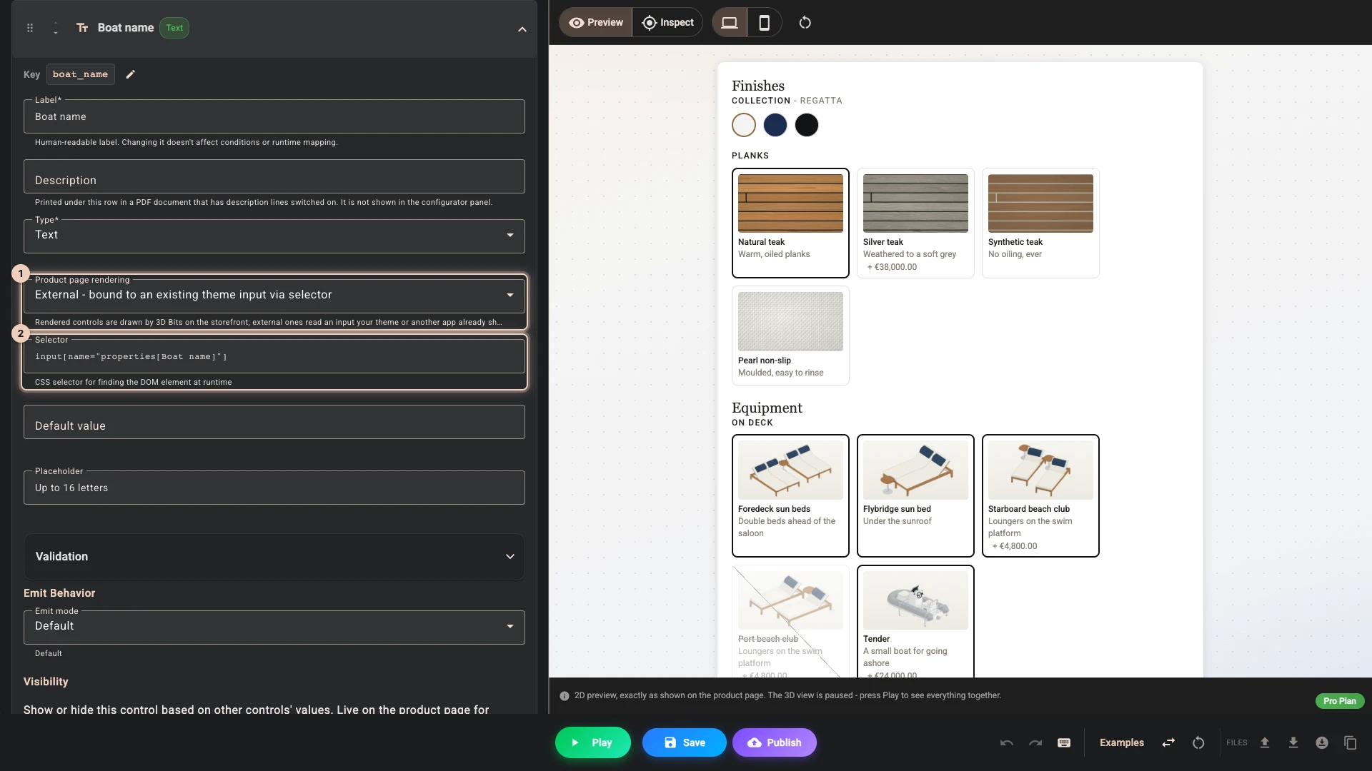
First it resolves the controls in your configuration. Any control you add in Composer with Product page rendering 1 set to External - bound to an existing theme input via selector carries a Selector 2, and the element that selector matches is read and reported under that control's Key. A checkbox control with options is read box by box instead - see a group of checkboxes.
Then everything else on the page is swept generically, and each remaining field is reported under a key derived from its name.
Binding by selector is the more robust of the two. The key is yours rather than your theme's, and the field is read whatever the collection mode is set to.
A selector is looked up in the ordinary document only, so it cannot reach a field inside a web component's shadow root. Such a field is read by the generic sweep under its name, so give it an explicit type and a stable name.
Use real form elements
3D Bits reads input, select and textarea elements, wherever they sit in the document. The generic sweep also looks inside the open shadow roots of web components, so a form built from custom elements is read normally, by the sweep rather than by a selector. A closed shadow root cannot be read, and nothing inside one is visible.
Reading pierces an open shadow root; being notified does not. A change event stops at the shadow boundary unless it is dispatched with composed: true, so a control inside a web component has to fire a composed change - see How 3D Bits notices a change.
Anything the shopper can choose therefore has to exist as an actual form field. This is not an arbitrary requirement, and meeting it does you other favours. Real form elements give you keyboard navigation, screen reader support and semantic meaning for free, so a form that works with 3D Bits is also a form that works for people using assistive technology.
Consider the difference between these two approaches:
Poor Practice - Custom Div Elements
<!-- This won't work with 3D Bits and breaks accessibility -->
<div class="custom-option" onclick="selectCollection('regatta')" data-value="regatta">Regatta</div>
<div class="custom-option" onclick="selectCollection('midnight')" data-value="midnight">Midnight</div>
Good Practice - Standard Radio Buttons
<!-- This works with 3D Bits and is accessible -->
<fieldset>
  <legend>Collection</legend>
  <label>
    <input type="radio" name="collection" value="regatta" checked />
    Regatta
  </label>
  <label>
    <input type="radio" name="collection" value="midnight" />
    Midnight
  </label>
</fieldset>
In the default Standard inputs collection mode, 3D Bits finds fields by their type. An <input name="boat_name"> with no type attribute is not one of them, and it is invisible. Write <input type="text" name="boat_name"> and it is read.
This does not apply to a field you bind to a Composer control by selector, which is read whatever its type.
What each element reports
Your configuration receives one entry per field. This table is the whole contract.
| Element | What your configuration receives |
|---|---|
<input type="radio"> | The value of the checked radio in the group, under the group's shared key. While nothing in the group is checked, the key is absent entirely. |
<input type="checkbox"> | true or false, from whether the box is ticked. On its own its value attribute is never read, and it reports on every pass whether ticked or not. A group of boxes bound to one checkbox control with options is the exception, below. |
<select> | The selected option's value, or its visible text when the value is empty. Plus one true/false entry per option (see below). |
<input type="number">, <input type="range"> | The value as a number. An empty field arrives as 0. |
<textarea> | The text, always as text - never converted to a number. |
<input type="text">, email, tel, url, date, time, datetime-local, month, week, color | The value, with the number rule below applied. An empty field arrives as an empty string. |
<input type="file"> | Bind it to a Composer control by selector and your configuration receives a temporary in-browser URL for the chosen file, which is what an image decal needs. The generic sweep only ever sees the browser's placeholder path, which is of no use. |
<input type="hidden">, password, search | Not collected in Standard inputs mode. See When Custom Solutions Are Necessary. |
This is the one that catches people out most often. <input type="checkbox" name="tender" value="yes"> does not hand your configuration the text yes. It hands it true when ticked and false when not, and it hands over false rather than falling silent, so there is no "no value was sent" state to configure against.
Write your conditions against true and false. Keep a value attribute on the checkbox if your own form submission needs one - for a single box it plays no part here.
A radio group behaves the opposite way. Only the checked radio reports, so a group with nothing selected produces no entry at all rather than an empty one.
A group of checkboxes
When several boxes are bound to one Composer checkbox control with options - which is what GUI Setup makes from a group of boxes - each option is read from its own box: the box its option's selector matches, or else the box under the control's selector whose value is the option's value. So here the value attribute matters: it is what ties a box to its option. With Allow multiple selections on, each option reports its own true or false, under the control's key, two underscores and the option value. With it off, the control reports the value of the ticked option, and nothing while no box is ticked, so write those conditions against the option values. A box in the group that matches no option is swept like any other field.
Values that look like numbers arrive as numbers. A text field holding 12 arrives as the number 12 rather than the text "12". Simple equality matching is unaffected either way, because it compares both sides as text. It does matter to a greater-than or less-than condition, and to a script, both of which then get a number without any conversion on your side. Dates, times, colours and anything else that is not a plain number arrive as text, and a textarea is never converted at all.
A select reports twice. As well as the selected value, every option in the list gets its own true/false entry keyed <name>_<option value>, with anything other than a plain ASCII letter (a-z, A-Z), digit, hyphen or underscore replaced by an underscore, so accented letters are replaced too. A <select name="length"> with options 15 m and 20 m therefore also produces length_15_m and length_20_m. This is how a <select multiple> remains usable: read the per-option entries rather than the single selected value.
Essential HTML Patterns for 3D Bits
Radio Buttons for Single Selections
When shoppers need to choose one option from several, as with the boat's Planks, radio buttons are the natural fit. The name attribute groups the options and becomes the key, and the value of whichever is checked is what you configure against.
<fieldset>
  <legend>Planks</legend>
  <label>
    <input type="radio" name="planks" value="natural_teak" checked />
    Natural teak
  </label>
  <label>
    <input type="radio" name="planks" value="silver_teak" />
    Silver teak
  </label>
  <label>
    <input type="radio" name="planks" value="synthetic_teak" />
    Synthetic teak
  </label>
</fieldset>
Give one radio in each group a checked attribute. Without it the group reports nothing at all until the shopper touches it, and your scene has no starting state.
Checkboxes for Multiple Selections
For things that are independently on or off, use checkboxes - and configure against true and false, not against a value.
<fieldset>
  <legend>On deck</legend>
  <label>
    <input type="checkbox" name="tender" checked />
    Tender
  </label>
  <label>
    <input type="checkbox" name="foredeck_sun_beds" />
    Foredeck sun beds
  </label>
  <label>
    <input type="checkbox" name="flybridge_sun_bed" />
    Flybridge sun bed
  </label>
</fieldset>
In Composer you would say that the tender shows when tender is true. If what you actually need is a choice between several named values rather than an on/off state, use a radio group or a select instead - those are the ones that report a value.
Select Dropdowns for Space-Efficient Options
When you have many options but limited screen space, a select is a clean, accessible solution.
<label for="length-selector">Length</label>
<select name="length" id="length-selector">
  <option value="15_m">15 m</option>
  <option value="20_m" selected>20 m</option>
  <option value="25_m">25 m</option>
</select>
Always give every option an explicit value. An option without one falls back to its visible text, which changes when you reword it or translate the page.
Range Inputs for Continuous Values
For dimensions and other numeric values the shopper adjusts within a range.
<label for="height-slider">Height: <span id="height-value">50</span>cm</label>
<input
  type="range"
  name="height"
  id="height-slider"
  min="30"
  max="100"
  value="50"
  oninput="document.getElementById('height-value').textContent = this.value" />
A range fires change when the shopper lets go of the handle, which is exactly when you want the scene to rebuild. The oninput handler above only updates your own read-out; it is not what 3D Bits listens to.
Number Inputs for Precise Values
When shoppers need to type a specific figure, a number input gives you validation and the right keyboard on mobile.
<label for="width">Width (cm)</label>
<input
  type="number"
  name="width"
  id="width"
  min="1"
  max="100"
  value="50" />
An empty number field arrives as 0 rather than as nothing, and its min attribute does not change that: the browser checks min when a form is submitted, but 3D Bits reads what the field holds. Give the field a sensible value, and make sure your configuration shows something sensible when the value is 0.
A field called quantity in your form is read like any other value and drives whatever you configure it to drive. It does not change how many units Shopify puts in the cart. Purchase quantity stays with your theme's own quantity field and with Shopify.
How 3D Bits notices a change
3D Bits listens on the document, not on your individual fields. That single detail explains almost every "it works when I click but not when my script sets it" report.
change is the primary trigger, and it must bubble. A native change on a real form control bubbles to the document by itself, so ordinary forms need nothing. An event you create yourself does not bubble unless you say so:
// Never seen - a plain Event does not bubble
field.dispatchEvent(new Event('change'));

// Seen, as long as the field is in the ordinary document
field.dispatchEvent(new Event('change', { bubbles: true }));

// Seen from anywhere, including inside a web component's shadow root
field.dispatchEvent(new Event('change', { bubbles: true, composed: true }));
Inside a web component, it must also be composed. Bubbling alone stops at the shadow boundary: a change event is composed: false by default, and a composed: false event never leaves the shadow root it was dispatched in, so the listener on the document never runs. This applies to the browser's own change events too - a native change fired by a control inside an open shadow root does not reach the document either. Add composed: true and it does. If your controls live in the light DOM, the two forms behave identically, so dispatching a composed change everywhere is the simplest thing to do.
A widget inside a shadow root often looks like it is working without this, because mouseup, touchend and keyup are composed and trip the fallback read described below. That is the fragile path: the same widget goes quiet the moment a shopper uses the arrow keys, or your own code sets a value programmatically. A composed change is the reliable one.
input is not listened for. A widget that only ever fires input is not read directly. Fire change as well when the value settles.
There are fallbacks, and you should not depend on them. Releasing the left mouse button, ending a touch, and pressing Enter each schedule a fresh read of the page shortly afterwards, anywhere on the page. This is why a click-driven custom widget often appears to work without dispatching anything. It is also why the same widget silently stops working for a shopper who changes the value with the arrow keys, or when your own code sets a value programmatically. Dispatch a change with bubbles: true, composed: true and the behaviour is the same for everyone.
Re-reading is cheap. Every pass compares the complete set of values against the previous one and does nothing when nothing has changed, so firing change more often than strictly necessary costs you nothing.
Critical Attributes for Success
The name attribute is what identifies a field to your configuration, so it is worth choosing deliberately.
With Receive input names as variants on - which is the default, and the setting we recommend - the key is exactly the name attribute, with any line breaks stripped out. A field with no name falls back to its id. A field with neither gets a generated placeholder such as input-text-no-name-id, which is a sign you should add a name.
Turn that setting off and 3D Bits first looks for a <legend> inside the field's immediate parent element and uses that text as the key, falling back to the name or id when there is none. It never reads a <label>, and it does not search up the tree, so a <legend> in a fieldset several levels above has no effect. Both this setting and Input collection mode live in the project's Storefront settings in the app, and on a placed block in the theme editor - see Common Settings.
Good names are:
- Descriptive:
planks,collection,lengthrather thanoption1orfield2 - Consistent: the same convention across every product you configure
- Stable: a rename silently breaks every condition written against the old name
- Unique on the page: see below
Two fields with the same name do not conflict, but only the first keeps the plain key. The second becomes name-1, the third name-2, in document order - so a configuration written against boat_name stops matching the moment a second boat_name field appears further up the page. That is a fragile thing to depend on, and the fix is unique names.
A name is also suffixed when an earlier key starts with that name followed by an underscore. After a field named boat_name, or a Composer control bound by selector with the key boat_length, a later field named boat arrives as boat-1. A select's per-option keys count too. Avoid names that are the start of another key on the page.
Radio groups are deliberately exempt. Every radio in a group shares one name and one key, which is the whole point of a group.
For example, avoid patterns like this:
<!-- DON'T DO THIS - the second field silently becomes boat_name-1 -->
<input type="text" name="boat_name" />
<input type="text" name="boat_name" />
Instead, use unique, descriptive names:
<!-- DO THIS - unique names are clear and reliable -->
<input type="text" name="boat_name" />
<input type="text" name="tender_name" />
A few of Shopify's own form fields legitimately appear more than once on a product page - id, form_type, product-id, section-id, utf8 and q among them. Those are recognised, and only the first occurrence of each is read rather than being suffixed.
Some themes append a section id to a field name, so options[Collection] becomes options[Collection]-8329 and the number differs on every page load. Composer handles this with the {{id}} placeholder, covered in Dynamic IDs in Input Names, though publishing refuses one in a condition that decides money. If you control the markup, a stable name is better than a placeholder.
Reading a field is not the same as recording it on the order. 3D Bits reads your fields to drive the 3D scene and its own logic. It does not turn them into line item properties - that is your form's job, using Shopify's own properties[...] naming, exactly as it would be without a configurator. Only controls that 3D Bits renders itself can be set to save their value on the order.
What Breaks the Integration
A control with no form element behind it gives 3D Bits nothing to read, and shuts out people who do not use a mouse:
<!-- Don't do this: none of these is a form field -->
<div class="option" onclick="changeOption('midnight')">Midnight</div>
<span class="custom-radio" data-value="midnight">Midnight</span>
- There is no
nameand novalue, so there is nothing to read even when the click is noticed. Adata-valueis not a form value. - Screen readers do not announce it as a selectable option, and the current selection is not communicated to them.
- Keyboard users cannot reach it.
A picture with an onclick fails the same way, however good it looks.
Testing Your Integration
To ensure your forms work correctly with 3D Bits and remain accessible:
-
Turn on debug mode and open the product page. The Live tab lists the fields the page sweep finds, under their own names, with their values. A field you bind to a Composer control by selector is listed under its own
name, not under the control's Key it reaches your configuration as, and a field only a selector reaches, such as a hidden input in Standard inputs mode, is not listed at all. The GUI Setup tab scrapes the page and hands you the field names, types and selectors as JSON, which saves working the selectors out by hand. Both tabs offer copy buttons. Turn it off before the page goes live, as shoppers can see it. See Enable Debug Mode.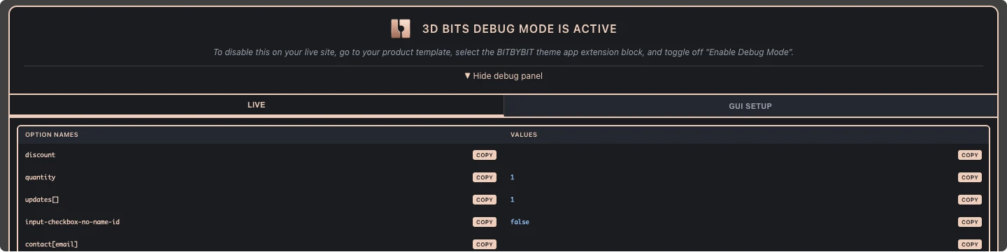
-
Change each option and watch the Live tab. The value should change with it. If a field you did not bind by selector is missing entirely, check that it has an explicit
typeattribute and aname, or switch Input collection mode to All inputs. -
Navigate with keyboard only. Press Tab through every interactive element, and change a value with the arrow keys rather than the mouse. If the scene follows a mouse click but not an arrow key, you are relying on the interaction fallbacks and need to fire a bubbling
change. -
Test with a screen reader. Use a built-in screen reader such as VoiceOver on macOS or NVDA on Windows to verify that options are announced clearly.
-
Check on mobile devices. Make sure form elements display and function correctly on touch interfaces.
When Custom Solutions Are Necessary
The approach described below should only be used when you genuinely cannot achieve your design with standard HTML form elements. It introduces complexity and accessibility problems that you then have to manage yourself.
Almost every "we need a custom swatch grid" case is solved better by keeping a real control and hiding it visually. The radio still exists, so the browser handles focus, keyboard and the bubbling change for you, and 3D Bits reads it with no special handling at all:
<fieldset class="swatches">
  <legend class="visually-hidden">Collection</legend>
  <label class="swatch">
    <input type="radio" name="collection" value="midnight" class="visually-hidden" checked />
    <span class="swatch__chip" style="background:#1b2a41" aria-hidden="true"></span>
    Midnight
  </label>
</fieldset>

<style>
.visually-hidden {
  position: absolute;
  width: 1px;
  height: 1px;
  overflow: hidden;
  clip-path: inset(50%);
  white-space: nowrap;
}
</style>
Style the .swatch__chip however you like, including on :checked and :focus-visible. Use this technique rather than display: none, which would take the control out of the tab order.
If you truly cannot, mirror your custom interface into a hidden field:
<!-- Custom visual interface -->
<div class="collection-picker">
  <div class="collection-option regatta" onclick="selectCollection('regatta')"></div>
  <div class="collection-option midnight" onclick="selectCollection('midnight')"></div>
</div>

<!-- Hidden form element for 3D Bits - NOT RECOMMENDED -->
<input type="hidden" name="collection" id="selected-collection" value="regatta" />

<script>
function selectCollection(collection) {
  // Update visual state
  document.querySelectorAll('.collection-option').forEach(el =>
    el.classList.remove('selected'));
  document.querySelector('.collection-option.' + collection).classList.add('selected');

  // Update the hidden field
  const field = document.getElementById('selected-collection');
  field.value = collection;

  // The event MUST reach the document, or 3D Bits never sees it
  field.dispatchEvent(new Event('change', { bubbles: true, composed: true }));
}
</script>
Two things make or break this pattern, and the second is the one people miss:
The event has to reach the document. new Event('change') does not bubble, so it is never noticed. bubbles: true is enough in the ordinary document; add composed: true as well and it also escapes a web component's shadow root, which costs nothing when there is no shadow root to escape.
A hidden input is not collected in Standard inputs mode. Do one of these, or the field is invisible however you dispatch the event:
- Add a control in Composer with Product page rendering set to External - bound to an existing theme input via selector and its Selector set to
#selected-collection. Selector-bound fields are read whatever the mode, and the value arrives under the control's own Key rather than undercollection. This is the option we would choose. - Or set Input collection mode to All inputs in the project's Storefront settings, which sweeps every input on the page including hidden ones.
Remember that this pattern leaves you responsible for keyboard navigation, for what screen readers announce, and for keeping the hidden field in step with the visible interface. Before implementing it, seriously consider whether the visually-hidden control above does the same job for less.
If you build a product options app
The same contract applies, and there is nothing you need to add on your side. 3D Bits reads whatever your app renders, so an app built from real form fields with reasonably stable name attributes works with us out of the box, and your merchants can pair it with a 3D configurator without either of us doing integration work.
Three things help those merchants in practice:
Keep field names stable across releases. A rename silently breaks any configuration built against the old name.
Fire a change event that reaches the document whenever a value settles - new Event('change', { bubbles: true, composed: true }) - especially if your controls render after page load or your framework sets values programmatically. composed: true is what carries the event out of a custom element's shadow root; without it a change never leaves one, not even a native one. An input event on its own is not enough.
Give every input an explicit type. Without one it is skipped in the default collection mode.
If you would like to check how your app behaves alongside 3D Bits, install both on a development store and turn on Debug Mode. It lists every field name and value we can see on the page, which is usually enough to answer the question in a couple of minutes. We are happy to look at the results with you, at info@bitbybit.dev.
Where to go next
Logic Without a Panel covers what happens to Composer's Logic rules when 3D Bits renders no panel of its own, which is exactly the situation this page describes. Using Another Options App covers the case where someone else's app renders the form instead of you.
Verified against the product in November 2026