Cart overview
A cart line shows a price and, at best, a list of properties. It says nothing about how the price was reached, and a boat at 4.9 million deserves more than that.
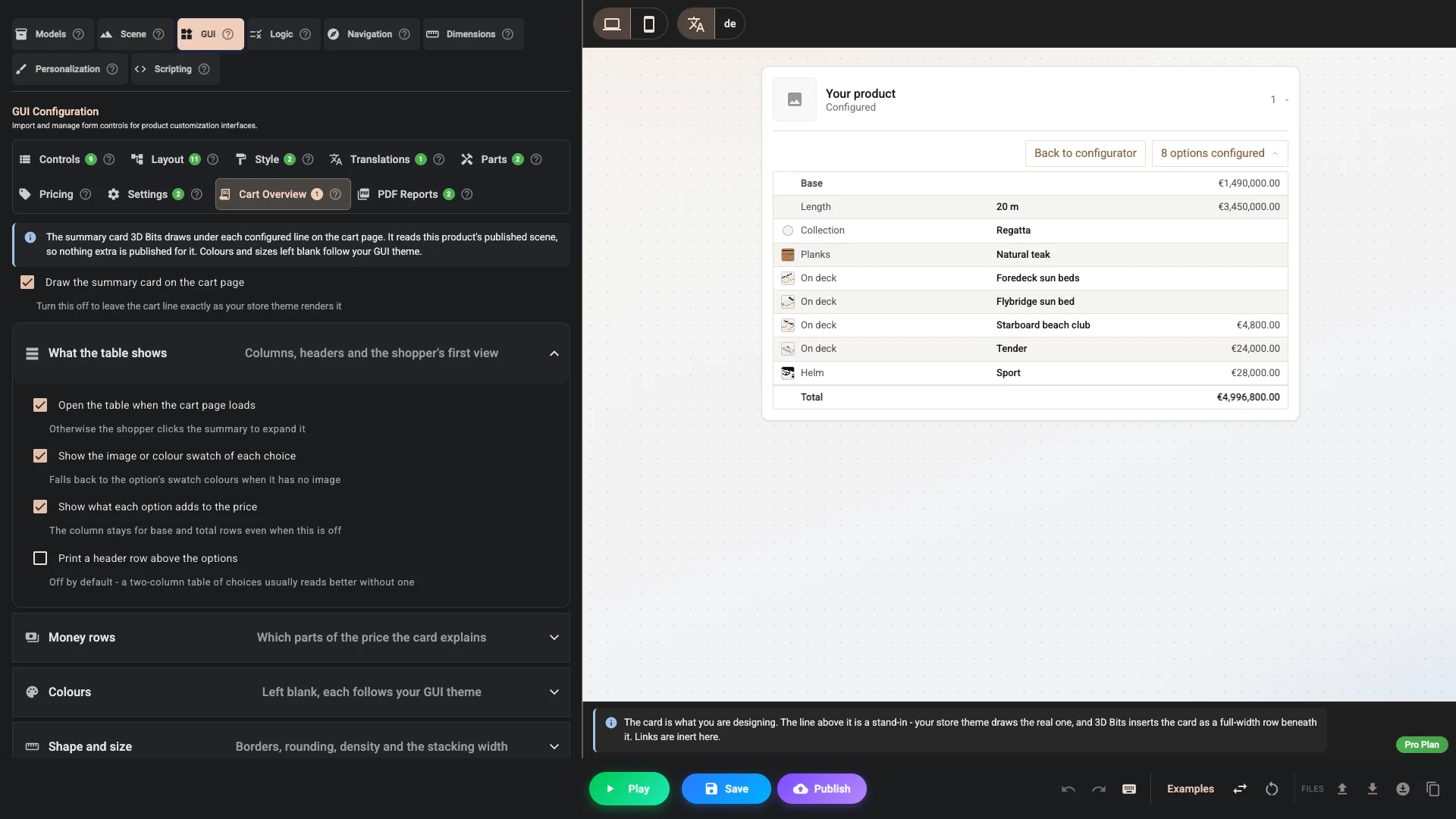
The Cart overview card fills that gap. It sits under the cart line, collapsed, showing how many options were configured. Opening it reveals the choices with their swatches, images and prices, the price breakdown, a picture of the configured product, and a link back to the configurator.
It is available on every plan and on by default, for products whose project has pricing switched on. A configurator without pricing leaves the cart line as your theme draws it. The card is drawn by the app embed, so that has to be on. Price it sets it up for the boat.
Where the card gets its information
Nothing extra is published for it. The card reads the product's own published scene - the same file the product page renders from - and the shopper's choices, which travel on the cart line itself.
That has two consequences worth knowing:
- Editing the card takes effect on the next publish, like any other scene change.
- A product that has never been published shows no card, because there is no scene to read.
The preview in this tab draws the card for each control's default choice under a stand-in cart line, whether or not pricing is on. Its Total is the configured price, where on the cart page it is what the line charges. It shows no captured image, and its links do nothing.
What the table shows
| Setting | What it does |
|---|---|
| Draw the summary card on the cart page | Turn the whole card off and leave the cart line exactly as your theme renders it. |
| Open the table when the cart page loads | Show the options expanded instead of waiting for a click. |
| Show the image or colour swatch of each choice | The small cell before each option, showing that option's image, or its swatch colours when it has no image. |
| Show what each option adds to the price | The price difference beside each choice. |
| Print a header row above the options | A row naming each column. Off by default - a short table of choices usually reads better without one. |
When the header row is on you can retitle the Option, Selection and Price columns. Leave a box empty to keep the built-in wording, which is translatable like every other built-in string.
Money rows
The card can print the parts of the price that are not attached to a single option, so the lines add up to the total:
- Base price - the starting price before any choices.
- Price formulas - anything computed from the configuration, such as a length or an area.
- Priced parts - the individual parts a configuration is made of.
- Total - what the cart line charges for the configured item before any discount, for every item on that line. When the line holds several, a row such as x 3 gives the price of one.
The other rows are worked out from the prices you have published, while the Total is what the cart charges. They add up when the two agree; a price changed in Shopify, a publish with new prices, or a variant of your product that costs more or less than the base price can leave them apart.
Without it, the listed options will not add up to the total, and a shopper who checks the arithmetic will think something is wrong.
These rows appear only when the shopper's cart is in your store currency. In another currency the card lists the choices without amounts, and a Total row in that currency.
Colours
Every colour is optional. Left blank, the card follows your GUI theme, so a configurator you have already styled produces a matching cart card with no extra work.
- Accent - the expand button and the back-to-configurator link. Follows the theme's accent.
- Outline and dividers - the table border and the hairlines between rows. Follows the theme's border colour.
- Alternating row - the tint on every second row, derived from the outline colour by default.
- Table background - transparent by default, so the cart row shows through.
- Text - deliberately not taken from the theme.
- Header background and Header text - shown once the header row is on. Follow the theme's accordion headers.
A configurator panel that floats over a dark 3D scene usually has light text. A cart page is not a 3D scene. Left blank, the card inherits the text colour your store theme already uses for that row, which is readable on both light and dark themes. Set it only if you have a specific reason.
If you use theme variants, Take defaults from theme variant picks which one the card follows.
Shape and size
Tint every second row, Draw a line between rows, Text size (px), Outline width (px) and Corner rounding (px) do what they say. Two others are worth explaining:
Row density switches between comfortable padding, which matches the option panel, and compact, which suits carts with many lines.
Stacks below (px), 560 by default, is the width at which each row stops being a table and starts stacking its label over its value. It is measured on the card itself, not on the browser window. That matters: a cart drawer is often only 400 pixels wide on a full-size desktop screen, and a card that asked the window would try to fit four columns into it. Because the card asks its own width, a narrow drawer stacks exactly the way a phone does.
Snapshot and reopen link
Show the captured image of the configuration shows the picture taken at Add to cart, at Snapshot width (px), and Show the link back to the configurator adds a link that reopens the exact configuration. The picture comes from the Order snapshot, so that has to be on, and it shows only for items added with Product lines charging. It is kept in the browser the shopper configured in, so another browser shows the card without it.
The reopen link is worth keeping on. 3D Bits also rewrites the theme's own product link on the cart line, but that depends on recognising your theme's markup. The button inside the card is drawn by 3D Bits, so no theme can defeat it.
Where it appears in the cart
Most stores need nothing here. 3D Bits finds each configured cart line by the key the cart gives it, then works outwards to the element your theme uses as that line's row, and puts the card there. On a cart laid out as a table the card gets its own full-width row beneath the line, so it is never squeezed into the product column.
Every field in this section is an escape hatch for a theme the automatic detection reads wrongly. They are CSS selectors, and a bad one is ignored rather than breaking the cart.
Show the card in decides what happens when your theme draws the same cart line twice - which most do, once on the cart page and again in the slide-out cart drawer. Left on the default, the card goes to the copy outside the drawer whenever there is one, and to the drawer when the drawer is the whole cart. Pin it to Cart page only or Cart drawer only if you prefer, or pick Everywhere the line appears to have it in both. The reopen link is rewritten on every copy regardless.
Cart line row (CSS) names the element that wraps one line - tr or .cart-item, for example. It is
matched outwards from that line's own quantity or remove control, so it can only ever find that line's
own container: one selector serves every line in the cart. A selector that turns out to wrap more than
one line is ignored, because a card that showed one shopper's choices against another line would be
worse than no card.
Anchor inside the row (CSS) and Position place the card against a particular part of the line instead of at its end. With no anchor set, the position is measured against the line itself.
Reopen link (CSS) names the link that should reopen the configurator with the shopper's choices, for themes whose product title is not an ordinary product link - a bundle parent, say. 3D Bits never rewrites your theme's Remove or quantity links, however broad a selector you give it.
Snapshot image (CSS) names the picture the captured configuration should replace, for lines that render several images and where the automatic guess picks the wrong one.
If you set any of these, open your cart with a configured product in it and check the result. Nothing here changes what a shopper is charged.
Translations
The card's own words - the summary line, the back-to-configurator label, and the built-in column
headers - appear in the translations dialog under cart.builtIn, alongside every other string.
A column title you type yourself in this tab replaces the built-in header for that column. It is not exempt from translation, though: your typed title appears in the same dialog under cart.columnLabels, so you can give it a translation for every language you support, exactly like a control's label.
Verified against the product in November 2026