Style and Translations
Style and Translations are two separate tabs in the GUI section, and this page covers both. One decides what the option panel looks like, the other what language it speaks. Neither changes what you ask the shopper - that is the Controls tab. The panel gives the boat its theme.
Making it look like your store
The Style tab controls how the panel looks. The goal is that a shopper never notices it came from an app.
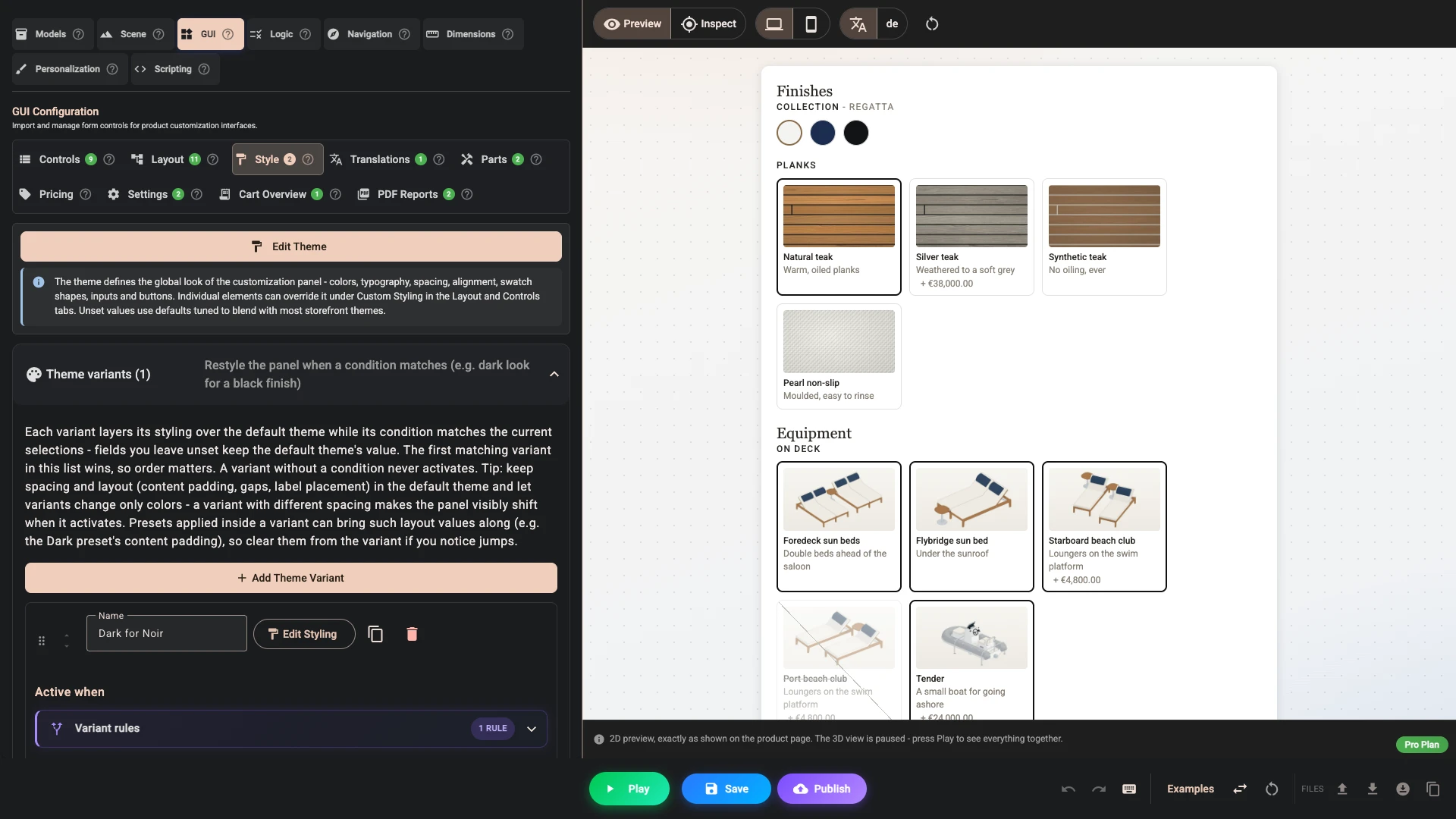
Create theme - Edit theme once you have one - opens a single dialog holding the whole look: colours, spacing, corner rounding, borders, type, and the appearance of every kind of control you can put in the panel. The field reference lists it all. A theme applies to everything at once. Individual elements can then override it from their Custom styling in the Layout and Controls tabs, which is how you make one add to cart button match your store's exact green without touching the rest.
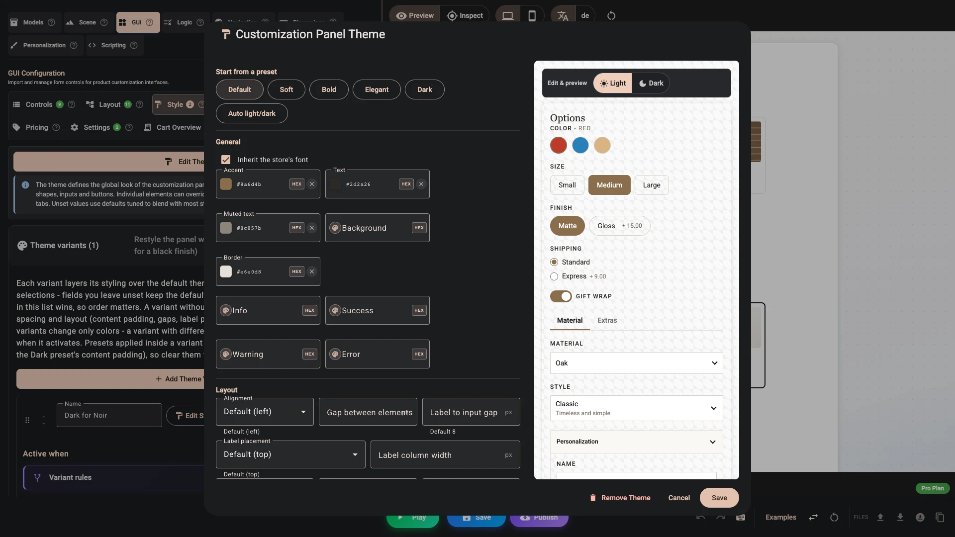
The dialog opens on Start from a preset. There are six - Default, Soft, Bold, Elegant, Dark and Auto light/dark - and each is a starting point you then adjust.
Clicking a preset clears every field in the dialog and refills it from the preset. Use one to start a theme, never to nudge one you have already tuned.
A live preview sits beside the form and follows what you type, so you can judge a change before you save it. Underneath the panel it also draws two canvas areas, which is where you see area cards as you edit them.
Take your colours from your actual theme rather than from memory. Most Shopify themes expose their palette in the theme editor, and copying the exact values is the difference between "matches" and "nearly matches", which the eye notices even when it cannot say why.
Inherit the store's font is on by default, so the panel simply picks up the typeface the product page already uses. Switch it off and the panel falls back to a neutral system font instead - worth doing when your store's display face is wrong for a dense column of options. Either way, a font family you set on a type role below wins over both.
Sizing the pictures
Two settings decide how big pictures are, and they are deliberately separate, because a card a shopper picks from and a thumbnail in a list want different sizes.
Card width, under Option cards, sets how wide an option card is. Cards never grow past the panel, so a width larger than the space available simply fills it. Cards lay out in as many columns as fit the panel, so this is the column width, and the picture fills it at the aspect you chose. Left empty, cards are at least 120px wide and stretch to fill the row. Set it and they keep that width - which is what you want when a control has two options and you do not want two enormous cards.
Picture size, under Parts list, sets how big each part's picture is in a parts list that has pictures switched on. It is a square, 40px by default.
Which setting controls which text
Type is set by role, not by component. There are five, and every piece of text in the panel follows exactly one of them, so a change to a role moves everything that shares it.
- Labels is the busiest one. It covers control labels and everything sized from them: accordion headers, tab labels, option card titles, the small description lines, price breakdown rows and confirmation text. If you are trying to make an accordion header bigger or bolder, this is the setting - not Headings.
- Headings covers section titles and Text elements set to the heading variant. Nothing else.
- Body covers Text elements set to the body variant, which is what you get if you do not pick one.
- Captions covers the caption variant, image captions, option descriptions and status lines. Captions take the theme's muted text colour, which is why the tab offers only a size for them.
- Price covers the total in a Price element, and the price after discounts beside it. The label beside it, the breakdown rows and the discounts underneath follow Labels, and so does the promo code chip. A total that a discount lowers is struck through in the muted text colour; discount amounts, discount tags and the percent saved take the theme's success colour, and the chip takes its tint from your accent colour.
Headers on their own
Following Labels is the default, not the only option. The Accordions & tabs section carries its own header type settings: fill them in and headers stop following control labels, which is how you get 16px bold headers over normal-weight labels underneath. Tab labels have the same treatment of their own.
To change one accordion rather than all of them, open that element's own style. There are two typography settings there and the difference between them is the whole point:
- Container header is the container's own title - the accordion header, the section title, the tab labels. It changes that text and nothing else.
- Label is the label role. On a container it cascades, so it restyles the header and every control label inside. Useful when you want a whole section to read smaller; surprising if you only wanted the header, which is what Container header is for.
Spacing, background and borders never cascade; they stay on the element you set them on. And a child with a style of its own always beats the one it would have inherited.
Dark mode
Above the preview is a Light and Dark toggle, and it does two jobs: it previews the panel in that scheme, and it switches the form to that scheme's fields. Move it to Dark and the form becomes Dark mode overrides.
- It follows the shopper's device or browser preference, not how your storefront looks. Someone browsing with their phone in dark mode gets the dark palette on an otherwise light store.
- Only colours can be overridden. Sizes, spacing, radii and shapes always come from the light theme, so the two schemes can never drift apart in layout.
- Every field you leave empty keeps its light value. Leave the section empty entirely and the panel looks identical in both schemes, which is a perfectly good answer.
- The Auto light/dark preset fills in a working set of dark colours for you, and you edit from there.
If your storefront theme flips itself rather than following the device, it can force the panel by setting data-bb-scheme="dark" - or "light" - on any parent element, such as the page body. Chrome and Edge honour it. Safari, Firefox and the browsers on an iPhone follow the device preference regardless, so check each before you rely on it.
The storefront panel
Everything above styles the contents of the panel. The Storefront panel section styles the box those contents sit in on the product page: its colour, its padding, its corner radius and its border.
- The panel colour falls back to the theme's background colour when you leave it unset.
- Anything else left unset keeps the storefront's built-in look - 16px of padding, a 12px corner radius, no border.
- Backdrop blur applies to the preview only. The real panel does not blur, because blurring a box that scrolls its own contents breaks the scrolling.
Where that panel sits on the product page, and how tall and wide it is, is not a styling question - those live in the app, on the project's canvas and placement settings.
Cards for anything outside the panel
A layout element does not have to stay in the main panel. It can go into one of nine places on the canvas - the corners, the middle of each edge and the centre - the area beside your buy buttons, or a custom area you anchor to your theme with a CSS selector. None of those places has any chrome of its own, so by default an element dropped into a canvas corner simply floats over the 3D view with nothing behind it.
Area cards give all of them one card: a colour, padding, a corner radius, a backdrop blur and a border. Fields you leave unset keep the transparent, chrome-less look. Unlike the storefront panel, the blur here is real, and it is usually what makes a control readable over a busy model.
Per-area overrides then treat one area differently. Pick the area, set only the fields you want to change, and everything else falls back to the global card above. Each area may appear once - add it twice and the first entry wins. Composer tells you when an override points at an area that no element is actually placed in, because a card is only ever drawn where something mounts.
Custom areas themselves are defined in the Layout tab; they show up here by their id once they exist.
Custom CSS
Custom CSS (advanced) at the bottom of the dialog is injected into the panel after everything the theme generates, so it wins wherever the two disagree. It is the escape hatch for the one detail the fields do not cover, and the field carries a small example to show the shape of it.
Keep it short. It is the only part of the Style tab nothing can check for you, and it is the first thing to remove when the panel starts looking wrong after a release.
Framing the 3D view
The border, corner radius and margins around the 3D view itself are not in the Style tab - they are the Canvas frame panel in the Scene section. It is worth a moment there: a hairline border in your theme's border colour, with the same corner radius your product cards use, usually does more than any other single setting to make the configurator look built into the page rather than dropped onto it.
Fonts
The Fonts accordion at the bottom of the Style tab is a registry. You add a family once and then refer to it by name everywhere else.
Each entry is a family with a Font family name of your choosing and one or more variants, each one weight or style of that family - regular, bold, an italic - with its own Font file URL, a Weight and a Style. Pick the family by name in any Font family field in the theme, and the weight you ask for there picks the variant.
One registry feeds four things:
- the panel's own typography,
- text decals in Personalisation,
- a font control you can offer the shopper, so they choose the typeface of their engraving,
- the branding font of your PDF documents.
Files can be .woff2, .woff, .ttf or .otf. Two things to watch:
- Keep the number small. Each family is something else your shopper's browser downloads before the panel looks right, and type is the slowest thing on the page to arrive.
- A PDF can only embed
.ttf,.otfand.woff. A.woff2is perfect in the panel and quietly falls back to a built-in face in the document, so if a family has to print as well as display, register a.ttfor.otfvariant of it too.
Theme variants
A theme variant restyles the panel while its condition matches the current selections. The obvious use is a product where the choice changes the mood, such as the Noir hull switching the panel to a dark treatment so the whole page follows the boat.
A variant layers over your theme rather than replacing it. Only the fields you set in the variant change; everything else keeps the value it already had. That is what makes a variant that changes three colours safe.
Four rules decide whether one ever runs:
- The first matching variant in the list wins, so order them from most specific downwards. Drag to reorder - earlier wins - and use Clone when two variants differ by one colour.
- A variant with no condition never activates. Fill in Active when.
- A variant with no styling is not saved. Composer says so on the card.
- Keep spacing and layout - content padding, gaps, label placement - in the base theme, and let variants change colours only. A variant with different spacing makes the panel visibly shift the moment it activates. Presets can drag layout values in behind your back, since the Dark preset brings its own content padding, so clear those from the variant if you notice a jump.
A variant can also supply the colours of a PDF document, which is how an order document ends up matching the configurator that produced it. That is set on the document, in PDF reports.
Used sparingly this is striking. Used on every option it is exhausting, and it makes the page feel unstable.
Field reference
Everything the two style dialogs hold, in the order they show it. A field left empty keeps the default, or the theme's value in an element's own style.
The theme dialog
| Section | What it sets |
|---|---|
| General | Inherit the store's font, and the palette the rest follows: Accent, Text, Muted text, Background and Border, then Info, Success, Warning and Error for messages. |
| Layout | Alignment, Gap between elements, Label to input gap, Label placement of Top, Left or Inline, the Label column width a left label takes, and the padding round the panel's contents. |
| Storefront panel | The box the panel sits in: Panel color, Panel padding, Corner radius, Backdrop blur, Border color, Border style and a border width per edge. |
| Area cards | The same for anything outside the panel, with Card color and Card padding, then Add area override for one area alone. |
| Typography - labels | The Labels role: Font family, Size, Weight, Color, Transform and Letter spacing (px). |
| Typography - headings | The Headings role: family, size, weight and colour. |
| Typography - body & captions | Body size, Body color and Caption size. |
| Typography - price | The Price role: family, size, weight and colour. |
| Inputs | Text boxes and dropdowns: Background, Text, Placeholder, Border, Focus border, Border width, Radius, Height and Font size. |
| Swatches | Shape of Circle, Square or Rounded, Size, border and Selected border, Selected width, Corner radius, Gap, Tooltip position, and Show selected label, which puts the chosen name beside the control's label. |
| Switches | Track (off), Track (on), Thumb (off), Thumb (on), Width, Height and a border. |
| Range sliders | Track, Fill, Thumb, Thumb border and their sizes. Value display is Tooltip above the thumb, Text next to the track, Tooltip and text or Hidden. Always show tooltip keeps it up, and Show min/max labels adds the scale under the track, off by default. |
| Option buttons (pills) | Colours, border, Radius, Height, Horizontal padding, Gap, Font size and Font weight, with Selected background, Selected text and Selected border. |
| Option cards | Border, Selected border, Radius, Image aspect for every card a control does not set itself, and Card width. |
| Parts list | Picture size. |
| Accordions & tabs | Header background, Header text, Border, Radius, Divider under header, the header's own type, then Tab style of Underline or Pills, Active, Inactive and the tab labels' own type. |
| Messages & buttons | Message radius and Show severity icon, then the buttons' colours, border, Height, Font size, Font weight, Full width, Shape and Icon only. |
| Button gradient & states | A Gradient from From to To in a Direction, then three colours each for hover, pressed and unavailable, such as Hover background. |
| Custom CSS (advanced) | See Custom CSS. |
An element's own style
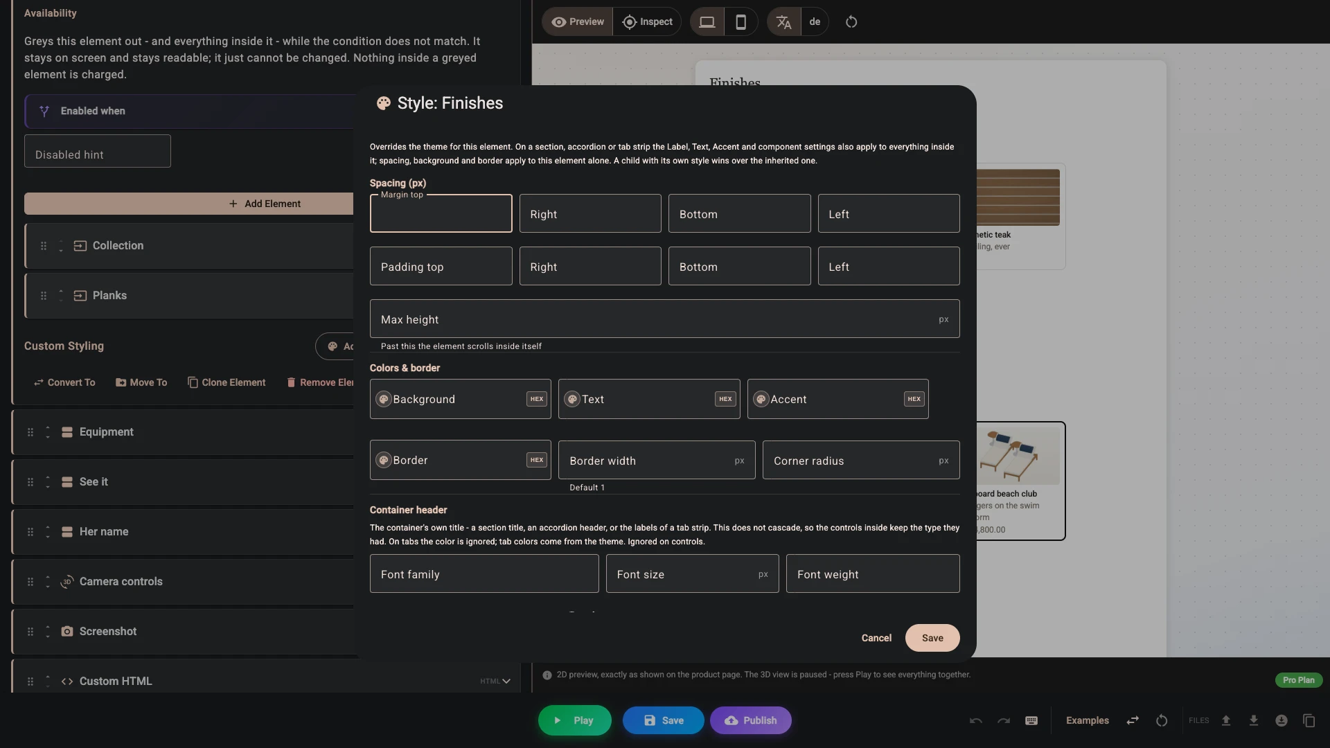
Each control and element carries Custom styling near the end of its row. Add, or Edit once it has a style, opens its dialog; Copy and Paste move a style from one element to another.
| Section | What it sets |
|---|---|
| Spacing (px) | Margin and padding per edge, and a Max height, past which the element scrolls inside itself. |
| Colors & border | Background, Text, Accent, Border, Border width and Corner radius. |
| Container header | The title of a section or accordion, or a tab strip's labels, as above. |
| Label | Label placement on a control, and the Labels role, which cascades on a container. |
| Inputs, Swatches, Option buttons (pills) and Buttons | The theme's fields for each, for this element alone. |
| Button gradient and Button states | The theme's gradient and the hover, pressed and unavailable colours. |
On a section, accordion or tab strip the label, text, accent and component settings reach everything inside. Spacing, background and border stay on the element itself.
Translations
The Translations tab is where you provide the panel's wording in other languages. Add translations opens the dialog. Add a language by the code your storefront uses for it, written exactly as Shopify writes it - fr, de, pt-BR - and you get a row for every translatable string, with your original beside the box you type into.
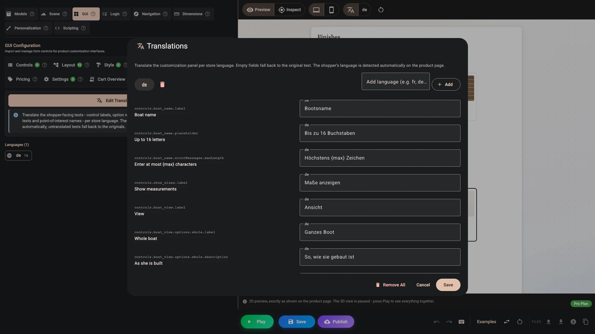
What you can translate
Far more than the labels:
- For each control: its label, its description, its placeholder, and the hint shown when the control is unavailable.
- For each option: its label, its description and its own unavailable hint.
- The error message of every validation rule you switched on for a control.
- Section, accordion and tab titles, and a section's description.
- Text and message elements, and an image's alt text and caption.
- A Link element's text and its destination, so a French shopper can be sent to the French page, and the whole markup of a Custom HTML element.
- The Price element's label and its promo code wording (the code itself stays as it is), the quantity label, the Parts list label and its empty text, the add to cart button's label and its success and failure text, the validation summary title, the Download PDF label, and a confirmation's heading and message.
- Formula labels, and part labels with their unit labels.
- Point of interest names, so a guided tour reads in the shopper's language too.
- The whole customer PDF: file name, section titles, options table column headers, your own text blocks, image shot labels and the footer.
- The panel's built-in wording - "No file chosen", "Added to cart", "Copy link", "Final price is confirmed at checkout", "Total after discounts", "You save {amount}", "Checking discounts…", the promo code chip's "Apply", "Copy code {code}" (the copy button's label, read out and shown on hover) and "Save {amount} with {code}", the camera controls' "Zoom in", "View from the top" and the rest of them, plus the PDF's built-in labels, listed whether or not you use a document.
Some text a shopper can see is not translatable and shows as written: a Property name you typed for a control or for the order snapshot, a switch's Yes or No on the cart line, the message shown when the cart already holds as many configured products as one order can take, and the messages checkout shows when it refuses a configured product. Those messages are in English.
The order document is translated only in part. The section titles, text and footer you wrote on it stay in your language. The option names, choices, part names and built-in labels it takes from the panel follow the shopper's language. So do the choices saved on the order: the option names always, and the control's name unless you typed a Property name for it.
How a language is chosen
The product page reports the storefront language the shopper is browsing in, so this follows however you have already set up your Shopify markets and languages. 3D Bits then uses one set of translations for each shopper: the set for the exact code if you added one (pt-BR), otherwise the set for the language alone (pt), otherwise your originals. Within that set, any string you leave empty shows your original, not the wording from another set. A half-finished translation is safe to save, but a regional set has to carry every string you want translated, not only the ones that differ.
Once you have added a language, the panel preview that sits beside the GUI tabs grows a language toggle: the translate icon shows your originals, and each code shows the panel exactly as that language's shoppers will read it.
Three things worth knowing
Translate the labels, never the values. Values are what the configurator matches against, and translating them breaks every rule you have written. Renaming a control's key carries its translations across with it; changing an option's stored value does not, so the old wording is simply left behind and you will need to enter it again.
Leave numbers and prices alone. Money is formatted automatically: your shop's own currency in the money format set in Shopify admin (Settings > General, then Change currency formatting), and any other currency the way the shopper's language writes it.
Keep the curly placeholders. Several built-in strings carry a {count}, a {min} or a {total}, and the real number is substituted in at the moment the message is shown. A translation that drops the placeholder loses the number with it.
If you sell in one language, skip this tab entirely.
Verified against the product in November 2026