Common Settings
This guide explains settings that are shared across multiple 3D Bits theme app extension blocks. Understanding these common settings helps you configure your 3D experiences consistently and efficiently.
Overview
The 3D Bits app provides four theme app extension blocks:
- BITBYBIT VIEWER - Display static 3D models, build no-code configurators
- BITBYBIT RUNNER - Create parametric configurators with code
- BITBYBIT PREVIEW - Embed full published bitbybit.dev projects via iframe
- BITBYBIT APPS - Run custom applications
Many settings are shared across these blocks, allowing consistent behavior and easier management.
Dynamic vs. Global Settings
All 3D Bits blocks support two configuration approaches:
Product-Specific Settings (Dynamic)
Some settings can be dynamically linked to product metafields, allowing you to configure unique values for each product. This is useful when:
- Different products need different 3D models
- Camera angles should vary by product
- Background colors should match product aesthetics
- Scene configurations differ between products
Which settings can be product-specific depends on the block:
- VIEWER: Model URL, Scene Configuration, Camera Position, Camera Target, Background Color
- RUNNER: Script URL, Camera Position, Camera Target, Background Color (these are optional - most use global settings)
- PREVIEW: iframe URL parameters (if your project supports them)
- APPS: Configuration URLs or parameters supported by your app
Global Settings
Most settings remain global - configured once in the theme editor and applied to all products:
- Runner CDN Link
- Camera Position (optional - can be product-specific for VIEWER/RUNNER)
- Camera Target (optional - can be product-specific for VIEWER/RUNNER)
- Background Color (optional - can be product-specific for VIEWER/RUNNER)
- Try to Prepend
- Prepend With Query Selector
- Remove Children Before Prepend
- Show Spinner
- Show Fullscreen Button
- Receive Input Names As Variants
- Input Collection Mode
- Enable Debug Mode
- Disable Inputs When Computing
These settings affect how the block behaves across all products and are typically set once at the theme level.
How to Link Settings to Metafields
To dynamically link a setting to a product metafield:
- Clear any default values from the setting field if present
- Click the cylinder icon on the right side of the setting
- Search for your metafield in the dropdown that appears
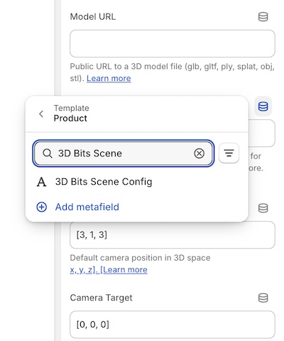
The search bar shows all available product metafields. If you created 3D Bits metafields automatically using the app dashboard, they'll appear in this list. Custom metafields with different names will also be available here.
Setting up metafields:
You can create metafields automatically using the 3D Bits app dashboard with one click, or manually through Shopify's product metafield settings. Learn more about setting up metafields.
Once you've linked settings to metafields, you'll manage all product-specific configurations directly in Shopify's product editor.
Settings by Block
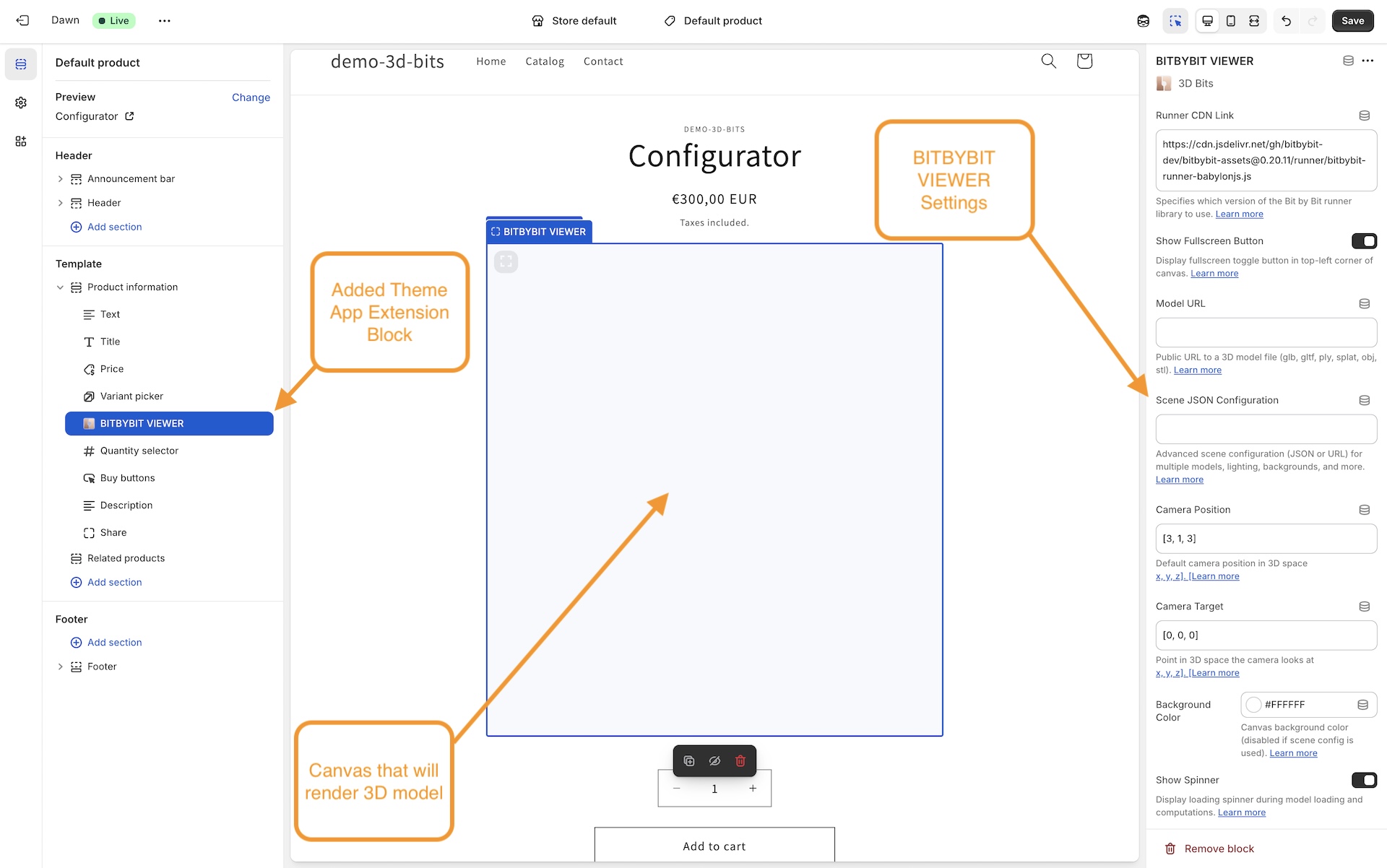
This image demonstrates where to find these Block settings for BITBYBIT VIEWER theme app extension block. Other blocks have them in the same place.
All Blocks (Viewer, Runner, Preview, Apps)
These settings are available in all four blocks:
Viewer and Runner Blocks
These settings are shared by VIEWER and RUNNER blocks:
Viewer, Runner, and Apps Blocks
These settings are shared by VIEWER, RUNNER, and APPS blocks:
Runner and Apps Blocks Only
These settings are specific to RUNNER and APPS blocks:
Setting Details
Runner CDN Link
Available in: VIEWER, RUNNER
Default: https://git-cdn.bitbybit.dev/v1.1.0
Specifies the CDN location from which the Bitbybit runner and all its assets (workers, WASM files, BabylonJS scripts, fonts, etc.) are loaded. The runner is the core engine that loads and renders 3D content in your browser.
Accepted Formats:
This field accepts two types of values:
- Base URL (recommended): A URL pointing to the root of the assets folder, e.g. https://git-cdn.bitbybit.dev/v1.1.0 or https://cdn.yourcompany.com/bitbybit/v1.1.0/. The runner script path (
runner/bitbybit-runner-babylonjs.js) is appended automatically. Trailing slash is optional. - Full JS URL (legacy, backward-compatible): A direct URL to the runner JavaScript file, e.g. https://git-cdn.bitbybit.dev/v1.1.0/runner/bitbybit-runner-babylonjs.js. This format is still supported for backward compatibility with existing configurations.
Why Base URL is Preferred:
When you provide a base URL, the system uses it for all assets - not just the runner script, but also the web workers (OCCT, JSCAD, Manifold), WASM binaries, BabylonJS engine files, physics engine, and fonts. This means that if you host assets on your own CDN, everything loads from your infrastructure consistently.
With the legacy full .js URL, the runner script loads from the specified URL, and the base CDN is derived automatically by stripping the known path. While this works, it's less explicit and only supports the standard runner path structure.
When to Change:
You should update this setting when you need features from a newer version of Bitbybit, when working with scripts created in a specific version of the bitbybit.dev editor, when you need to roll back to a previous version for compatibility reasons, or when you want to host assets on your own CDN.
Why Manual Updates?
Runner versions are not updated automatically to maintain stability for your product configurators. Web standards and 3D technologies evolve continuously, and the runner package integrates these technologies into a single, cohesive system. While automatic updates might seem convenient, they can introduce breaking changes that could disrupt your live configurators without warning.
Manual version control gives you the opportunity to test updates in a safe environment before deploying them to production. This approach is particularly important because new runner versions may include API changes that affect how your configurator logic communicates with the underlying 3D engine. By managing updates yourself, you can ensure continuity of service for your customers.
Safe Migration Workflow:
When you're ready to update your runner version, follow this zero-downtime process:
- Duplicate your product that contains the configurator and set it to Draft status
- Create a duplicate of the product template and configure it to use the latest runner version
- Link the duplicated template to your Draft product
- Test thoroughly to ensure your configurator works as expected
- Deploy to production once testing confirms everything functions correctly
This workflow ensures that if issues arise during testing, your live webshop products remain unaffected and continue serving customers without interruption.
Troubleshooting After Updates:
The resolution approach depends on which block type you're using:
For BITBYBIT VIEWER:
- Import your configuration back into Viewer Editor to identify and fix any broken settings
- The editor attempts to automatically migrate configurations when breaking changes are introduced to Scene JSON format
- Use the visual interface to update any deprecated settings
For BITBYBIT RUNNER:
- Open your scripts in the bitbybit.dev editors (Monaco, Rete, or Blockly) to diagnose issues
- Address any errors caused by API version changes
- The web editors attempt automatic migrations during import, such as updating Bitbybit API function names
- Complex scenarios involving deeper game engine features may require manual intervention
While the editors provide automatic migration assistance, configurations using advanced features or direct game engine APIs may need manual review and adjustment. Test thoroughly after each update.
URL Format Examples:
Base URL format (recommended):
https://git-cdn.bitbybit.dev/v{VERSION}
Full JS URL format (legacy, backward-compatible):
https://git-cdn.bitbybit.dev/v{VERSION}/runner/bitbybit-runner-babylonjs.js
Self-hosted base URL:
https://cdn.yourcompany.com/bitbybit/v{VERSION}/
Replace {VERSION} with the desired version number (e.g., 1.1.0).
Self-Hosting Assets on Your Own CDN:
For production-critical applications, we strongly recommend hosting Bitbybit assets on your own CDN infrastructure. This provides several important benefits:
- Reliability: Your configurators continue working even if the Bitbybit CDN or its underlying provider (e.g., Cloudflare) experiences downtime
- Performance: Choose a CDN provider optimized for your customers' geographic regions
- Control: Pin specific versions and manage updates on your own schedule
- Compliance: Meet enterprise requirements for asset hosting and security policies
To self-host:
- Download the assets from the Bitbybit Assets Releases on GitHub
- Upload them to your CDN, preserving the folder structure
- Set the Runner CDN Link to your CDN's base URL (e.g., https://cdn.yourcompany.com/bitbybit/v1.1.0/)
When you provide a base URL pointing to your own CDN, all assets - the runner script, web workers, WASM files, and engine dependencies - load from your infrastructure. This gives you complete control over availability and performance.
For a comprehensive guide on downloading assets, identifying which files you need, configuring CDN providers, and testing your setup, see Hosting Bitbybit Assets on Your Own CDN.
In the event that the primary CDN fails to load the runner script, the 3D Bits app will attempt to load it from a fallback CDN automatically. This provides an additional safety net, but should not be relied upon as a primary strategy. For mission-critical applications, self-hosting your assets is the most reliable approach.
Check the runner docs to learn more about how the runner works.
Visit Find Release Info on our GitHub to know which runner version is the latest.
Camera Position
Available in: VIEWER, RUNNER
Default: [3, 1, 3] (VIEWER), [30, 10, 30] (RUNNER)
Camera Position defines where the 3D camera is located in the scene's coordinate system. This determines the initial viewing angle of your content.
For the VIEWER block, if you're using Scene JSON Configuration, camera settings defined in the scene config will take precedence over this setting. You can create and manage scene configurations using the Viewer Editor.
Format:
Provide a vector3 array in the format [x, y, z]:
- x - Left/Right position (negative = left, positive = right)
- y - Up/Down position (negative = down, positive = up)
- z - Forward/Backward position (negative = backward, positive = forward)
Default Values Explained:
- VIEWER
[3, 1, 3]: Closer view suitable for pre-made 3D models - RUNNER
[30, 10, 30]: Further back because parametric geometry often spans a larger area
Examples:
[3, 1, 3]      // Close view for product models
[30, 10, 30]   // Far view for large generated geometry
[0, 2, 5]      // Directly in front, elevated
[-2, 1, -2]    // Behind and to the left
[0, 20, 0]     // Top-down view directly above
Finding the Right Position:
- Start with the default values for your block type
- Adjust based on your content's size and orientation
- Combine with Camera Target to frame your content perfectly
Larger values move the camera further from the origin (0, 0, 0). If your content appears too small or too large, adjust the distance by scaling all three values proportionally.
Dynamic Camera Control (RUNNER only):
In the RUNNER block, your parametric scripts can also control the camera programmatically through both Low-Code (Blockly/Rete) and Pro-Code (TypeScript in Monaco editor). This allows you to:
- Adjust camera position based on generated geometry size
- Create animated camera movements
- Define custom camera behaviors per variant
Camera Target
Available in: VIEWER, RUNNER
Default: [0, 0, 0] (VIEWER), [0, 15, 0] (RUNNER)
Camera Target defines the point in 3D space that the camera looks at. This is sometimes called the "look at" point.
For the VIEWER block, if you're using Scene JSON Configuration, camera settings defined in the scene config will take precedence over this setting. You can create and manage scene configurations using the Viewer Editor.
Format:
Provide a vector3 array in the format [x, y, z]:
[0, 0, 0]      // Looking at the origin (VIEWER default)
[0, 15, 0]     // Looking 15 units up from origin (RUNNER default)
[0, 1, 0]      // Looking 1 unit up from the origin
[2, 0.5, 1]    // Looking at a custom point
How It Works:
The camera will always point toward this target position. Combined with Camera Position, this defines the viewing angle:
- Camera Position = Where the camera is located
- Camera Target = What the camera looks at
Default Values Explained:
- VIEWER
[0, 0, 0]: Looking at the origin where models are typically centered - RUNNER
[0, 15, 0]: Targets a point elevated from the origin, suitable for typical parametric objects that extend vertically
Example Setup:
For a product sitting on a table:
// Camera Position
[3, 2, 3]     // Camera positioned above and to the side

// Camera Target
[0, 0.5, 0]   // Looking at the center of the product
If your model isn't centered at the origin, adjust the camera target to point at your content's center. You can find the center coordinates by loading it in 3D software like Blender.
Dynamic Control (RUNNER only):
Like camera position, your parametric scripts can control the camera target programmatically to automatically frame generated geometry.
Background Color
Available in: VIEWER, RUNNER
Default: #ffffff (white)
Sets the background color of the 3D canvas. This creates the environment color behind your 3D content.
For the VIEWER block, this setting is disabled if you're using Scene JSON Configuration. Scene configurations support advanced backgrounds including:
- Solid colors
- Linear gradients
- Radial gradients
- Background images
- Skyboxes (HDR environments)
You can configure these advanced backgrounds using the Viewer Editor.
Usage:
Provide any valid CSS color by using a color picker.
Examples:
#ffffff   // Clean white background
#f5f5f5   // Subtle gray
#f0f0f0   // Light gray
#2c3e50   // Dark blue-gray
#000000   // Dramatic black background
Best Practices:
Choose a background color that:
- Matches your theme's design
- Provides good contrast with your 3D content
- Complements your product photography style
When to Change:
Match your theme's color scheme:
- Light themes - Use white or light gray backgrounds
- Dark themes - Use dark gray or black backgrounds
- Brand colors - Use subtle brand-aligned colors
Neutral backgrounds (white, light gray) work best for showcasing 3D content, as they don't distract from the models or generated geometry.
Priority Order (VIEWER only):
Background settings are applied in this priority order (highest to lowest):
- Scene JSON Configuration (skybox or advancedBackground)
- Scene JSON Configuration (backgroundColor)
- This block setting
If you're using Scene JSON Configuration with skybox or advanced backgrounds, this setting will be ignored.
Public Script URL
Available in: RUNNER, APPS
Default: Empty
Controls which script or application the block loads from an external source. This setting enables different workflows depending on the block type.
For RUNNER Block: Loads parametric scripts created in bitbybit.dev editors (Blockly, Rete, or Monaco). When empty, uses Inline Script instead.
For APPS Block:
Controls the three-mode development workflow (Local Development, Preview, Production). When empty, defaults to https://localhost:4242 for local development.
Format:
Provide a fully qualified URL to your file:
https://example.com/scripts/my-file.txt
https://localhost:4242/assets/index-stable.js
https://cdn.shopify.com/s/files/1/xxx/index-hash.js
File Requirements:
- Publicly accessible (no authentication required)
- CORS-enabled if hosted on different domain
- RUNNER: text/plain format with exported script from bitbybit.dev
- APPS: ES6 module JavaScript file compiled with Vite
Hosting Options:
- Shopify CDN - Upload via Content → Files (recommended for production)
- Local Development - localhost:4242 (APPS only)
- Cloud Storage - AWS S3, Google Cloud Storage, etc.
- CDN Services - Cloudflare, jsDelivr
- Your Own Server - Any HTTPS server with CORS headers
CORS Requirements:
If hosting on a different domain, ensure proper CORS headers:
Access-Control-Allow-Origin: *
Access-Control-Allow-Methods: GET, OPTIONS
Access-Control-Allow-Headers: Content-Type
Block-Specific Usage:
For detailed usage instructions specific to each block, see:
- RUNNER: Public Script URL setting - Script loading and priority
- APPS: Public Script URL setting - Development modes and workflow
Show Fullscreen Button
Available in: VIEWER, RUNNER, PREVIEW, APPS
Default: true
Controls whether the fullscreen toggle button appears on the canvas. When enabled, users can click the button to enter/exit fullscreen mode.
Usage:
- Enable for immersive 3D experiences
- Disable if your theme handles fullscreen differently
- Useful for detailed product visualization
Technical Note: The fullscreen button uses the browser's Fullscreen API and respects user permissions.
Show Spinner
Available in: VIEWER, RUNNER, APPS
Default: true
Controls whether a loading spinner appears while 3D content is loading or computing.
Usage:
- Enable to provide visual feedback during loading
- Disable if you have custom loading indicators
- Recommended to keep enabled for better user experience
When it appears:
- VIEWER: While loading 3D models or scene configurations
- RUNNER: During script execution and geometry generation
- APPS: During application initialization and data loading
Receive Input Names As Variants
Available in: VIEWER, RUNNER, APPS
Default: true
Determines whether the block uses technical input element names or display labels when collecting variant data.
Options:
- Enabled (recommended): Uses the
nameattribute of input elements - Disabled: Uses the visible label/text of inputs
Why this matters: Technical names are more reliable because:
- They don't change when you update display text
- They're not affected by translations
- They remain consistent across theme updates
Example:
<!-- Input element -->
<input name="Size" value="Large">
  <label>Product Size</label>
</input>

<!-- With setting enabled: "Size" = "Large" -->
<!-- With setting disabled: "Product Size" = "Large" -->
Recommendation: Keep enabled unless you have specific reasons to use display labels.
Dynamic IDs in Input Names
Many Shopify themes generate input names with random IDs that change on every page reload. For example:
<input name="options[Color]-12345" value="red">
<input name="options[Size]-67890" value="large">
When these IDs change, your variant matching will break. To handle this:
In Viewer Editor, use the -{{id}} placeholder to match dynamic IDs:
options[Color]-{{id}}
options[Size]-{{id}}
This pattern tells the system to match the input name regardless of what the actual ID value is. The system will automatically find inputs that match the pattern before the - character.
Use Enable Debug Mode to see the actual input names on your product page and identify if they contain dynamic IDs.
Theme and App Updates
When you update your Shopify theme or third-party option apps (like custom variant selectors, product customizers, or advanced option apps), the input field names may change. This will break your existing variant matching configuration.
Recommended Update Process:
For Theme Migrations:
- Use Shopify's theme preview mode to test the new theme before publishing
- Enable Debug Mode on the product page template in preview
- Check the debug panel to see the new input field names in the updated theme
- Open Viewer Editor and use the option name edit feature to rename old input names to match the new theme
- Test all product variants thoroughly in preview mode
- Disable Debug Mode in the template
- Publish the new theme once everything is confirmed working
For Third-Party App Updates:
- Duplicate affected products and set the duplicates to Draft status
- Install or update the third-party app (or test different app versions on Draft products)
- Enable Debug Mode on the Draft product page template
- Check the debug panel to identify how the app's input field names differ
- Update your configuration in Viewer Editor using the option name edit feature
- Test thoroughly on Draft products to ensure configurators work with the new app version
- Disable Debug Mode in the template
- Apply changes to live products once testing is complete
Best Practice: Testing in Shopify's theme preview mode for theme migrations, or using Draft products for app updates, ensures zero downtime and prevents broken 3D viewers from being visible to customers during the update process. The Viewer Editor's option name edit feature makes bulk renaming quick and efficient across all affected configurations.
Third-party apps that modify product forms (variant selectors, product customizers, option apps) can introduce breaking changes to input names or values at any time, often without notice. When this happens, your 3D configurators will break immediately on live product pages, potentially affecting customer experience and sales.
To ensure maximum stability:
- Use trusted, established themes that maintain consistent input naming conventions across updates
- For mission-critical implementations, consider building your own custom product form UI with stable, controlled input names and values
- Avoid heavy dependency on third-party apps that frequently update their DOM structure or input patterns
- Document your input naming patterns and monitor for changes during any app or theme updates
For Developers:
If you're building custom product forms or Shopify apps, follow our integration guidelines for developers to ensure your forms work reliably with 3D Bits. These guidelines cover best practices for input naming, value structures, and event handling that maintain configurator stability.
Partner App Integration:
We're actively working with partner app developers to provide dedicated, reliable integration strategies for popular Shopify apps. When available, these partner-specific strategies will appear as options in the Input Collection Mode dropdown, offering optimized input collection that's specifically designed for each partner app's structure. This eliminates guesswork and provides guaranteed compatibility with partner apps that implement our integration standards.
Input Collection Mode
Available in: VIEWER, RUNNER, APPS
Default: standard
Controls which page inputs the block monitors for changes.
Options:
- Standard Inputs: Monitors typical product form inputs (variants, quantity, etc.)
- All Inputs: Monitors all input elements on the page
Use Cases:
Standard Inputs (recommended):
- Standard product pages with variant pickers
- Typical Shopify product forms
- Most use cases
All Inputs:
- Custom forms with additional configuration fields
- Pages with non-standard input elements
- Advanced product customization scenarios
- Integration with custom form builders
Performance Note: "All Inputs" mode may impact performance on pages with many input elements. Use only when necessary.
All Inputs mode may capture unintended fields like search boxes or newsletter signup forms. Use Enable Debug Mode to verify which inputs are being collected.
Future Compatibility
We're continuously improving 3D Bits to support popular third-party Shopify apps. As we add native support for specific apps, the names of the supported apps will appear here as additional input collection strategies.
Enable Debug Mode
Available in: VIEWER, RUNNER, APPS
Default: false
Shows a debug panel with technical information about the 3D canvas and current state.
Debug Information Includes:
- Current input values and variant selections
Usage:
- Development: Enable to troubleshoot issues
- Production: Always disable for live stores
- Support: Enable temporarily when working with 3D Bits support
Warning: The debug panel is visible to customers when enabled. Only use during development or troubleshooting.
When to Use
Enable debug mode when:
- Setting up a new block for the first time
- Configuring Receive Input Names As Variants
- Troubleshooting why variants aren't working
- Identifying input field names
- Testing Input Collection Mode settings
Example Debug Output
{
  "color_variant": "red",
  "size_variant": "large",
  "material": "wood",
  "quantity": "1"
}
Usage Workflow
- Enable debug mode in theme app extension block settings
- Visit your product page
- Note the input field names and types
- Use this information in your configuration
- Disable debug mode when done
Always disable debug mode before making your site live. The debug panel is visible to all visitors and reveals technical details about your page structure.
Try to Prepend
Available in: VIEWER, RUNNER, PREVIEW, APPS
Default: false
Attempts to move the 3D canvas to a different location on the page using CSS selectors.
Why use this:
- Position canvas in the product media gallery
- Replace existing product images with 3D content
- Integrate with specific theme layouts
- Control canvas placement without theme code modifications
How it works: When enabled, the block searches for the element specified in Prepend With Query Selector and moves the canvas before (prepends to) that element's content.
Example scenarios:
- Place 3D canvas at the top of product media gallery
- Replace main product image with 3D viewer
- Insert canvas into specific theme sections
Requirements:
- Must specify a valid Query Selector
- Target element must exist on the page
- May need different selectors for different themes
Prepend With Query Selector
Available in: VIEWER, RUNNER, PREVIEW, APPS
Default: div.product__media-wrapper
The CSS selector for the target element when Try to Prepend is enabled.
Common Selectors by Theme:
| Theme | Recommended Selector |
|---|---|
| Dawn | div.product__media-wrapper |
| Debut | div.product-single__photos |
| Brooklyn | div.product-single__photo |
| Custom | Inspect your theme to find the appropriate selector |
What is a Query Selector?
A query selector is a CSS-like pattern that identifies an HTML element on your page. It's the same syntax used in CSS stylesheets.
Default Value Explained
div.product__media-wrapper targets:
- A
<div>element - With the class
product__media-wrapper
This is a common class name in Shopify themes for the product image gallery area.
Common Selectors
/* By class name */
.product-images          /* Element with class="product-images" */
div.gallery             /* div with class="gallery" */

/* By ID */
#product-media          /* Element with id="product-media" */

/* By tag and class */
section.product-main    /* section with class="product-main" */

/* More specific */
.product .media-gallery /* .media-gallery inside .product */
Finding the Right Selector
- Open browser developer tools (F12 or right-click → Inspect)
- Find the element you want to target in the Elements/Inspector tab
- Look for the element's class or ID in the HTML
- Test your selector in the browser console:
If it returns the correct element, your selector works!
document.querySelector('your-selector-here')
Best Practices
- Be specific enough to target only one element
- Prefer classes over IDs when possible
- Test on multiple products to ensure consistency
- Avoid overly complex selectors that might break with theme updates
Different Shopify themes use different class names. Check your specific theme's HTML structure to find the correct selector.
Example Selectors for Popular Themes
/* Dawn theme */
div.product__media-wrapper

/* Debut theme */
.product-single__photos

/* Brooklyn theme */
.product__main-photos

/* Custom theme - check your HTML */
.your-theme-class
This setting only takes effect when Try to Prepend is enabled.
Remove Children Before Prepend
Available in: VIEWER, RUNNER, PREVIEW, APPS
Default: false
When enabled, clears all existing content from the target element before inserting the 3D canvas.
Use this when:
- You want to replace existing product images entirely
- The target container has conflicting content
- You need a clean slate for the 3D canvas
- Removing default product media
Use with caution:
- This permanently removes existing content from the page
- Users won't see standard product images as fallback
- Consider accessibility and users without JavaScript
- Test thoroughly before enabling on production
Typical workflow:
- Enable Try to Prepend
- Set Prepend With Query Selector to target container
- Enable this setting to clear existing images
- Canvas becomes the sole content in that container
Recommendation: Only enable if you're certain the 3D canvas should be the only content in the target element.
Common Use Cases
Replace product photos with 3D:
- Enable this setting
- 3D canvas becomes the primary product visualization
- Traditional photos are removed
Add 3D as first image:
- Disable this setting
- 3D canvas appears first
- Traditional photos remain available below
When enabled, this hides existing elements from the page. Make sure you don't need the removed content to be visible, or that it's duplicated elsewhere.
Disable Inputs When Computing
Available in: RUNNER, APPS
Default: false
Disables product form inputs (variant pickers, quantity, etc.) while scripts are executing or applications are processing.
Why use this:
- Prevents users from making changes during computation
- Avoids race conditions with multiple rapid changes
- Ensures clean execution of parametric scripts
- Provides clear feedback that processing is occurring
User Experience:
- Input elements become visually disabled (grayed out)
- Users cannot interact with form controls
- Inputs re-enable automatically when processing completes
- Works in combination with Show Spinner
Recommended for:
- Complex parametric scripts with long execution times
- Scenarios where rapid input changes cause issues
- Products with many interdependent options
- Configurations that require sequential processing
Not recommended for:
- Fast-executing scripts (< 100ms)
- Simple product variants
- When user experience requires immediate responsiveness
Technical Note: This setting is only available in RUNNER and APPS blocks because VIEWER and PREVIEW blocks don't execute custom code that requires input locking.
Best Practices
Development vs Production
During Development:
- Enable Debug Mode to troubleshoot issues
- Test Try to Prepend with different selectors
- Experiment with Input Collection Mode settings
In Production:
- Always disable Debug Mode
- Keep Show Spinner enabled for user feedback
- Use Receive Input Names As Variants for reliability
Canvas Positioning
When using Try to Prepend:
- Find the correct selector for your theme
- Test on multiple product pages
- Verify responsive behavior on mobile
- Consider what happens with Remove Children Before Prepend
- Document your selector choices for future reference
Performance Optimization
- Use Standard Inputs mode unless you specifically need all inputs
- Enable Disable Inputs When Computing for slow operations
- Test with Show Spinner to ensure users know something is loading
Consistency Across Blocks
If you use multiple 3D Bits blocks on your store:
- Keep common settings consistent for similar user experience
- Use the same prepend selectors across blocks
- Maintain consistent debug and spinner behavior
Related Documentation
For block-specific settings, see:
For setup and configuration:
Support
If you need help with common settings:
- Check the FAQ
- Contact support through the Shopify app dashboard or directly at info@bitbybit.dev
- Visit bitbybit.dev for additional resources